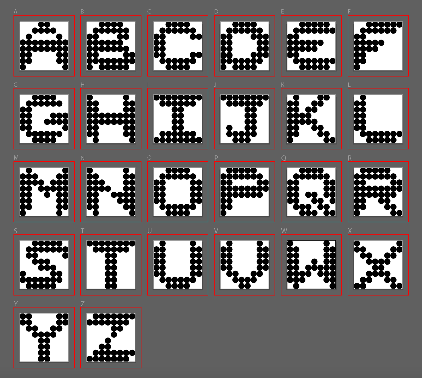
I was tasked with designing a prototype for a bitmap typeface by designing letters on 8 x 8 grids using squares or dots. The font I designed is made exclusively using circles and is called Hold-Punched since it is intended for each letter to look like they were made with a hole punch. Each letter has both a width and height of eight circles and is meant to translate a rigid dot structure and uneven lines into soft curves, creating a bold and legible alphabet.