Client: Shaan Arora & Cory Gill, Alia Technologies
Role: Design Lead
Designer Team: Manny Hong, Jyaleen Wu, Emily Liu, Jessica Brown
Date: August 2022 - December 2022
What is Alia?
Alia Technologies (also known as Alia) is a software startup that aims to help business gain and retain customers by building up their relationship with their shoppers. Alia will be a cost effective solution for business who are currently having issues with customer retention. Alia aims to help businesses build customer loyalty by giving them the opportunity to share their story and mission with the world.
What is a design lead?
Alia teamed up with Generate Product Development for this project, and I was hired as a design lead through Generate. Design leads are the main connection between the project lead, clients, and rest of the design team and are responsible for communicating with their project lead to align the team with the goals of their client as well as manage the progress and learning of the designers.
Design leads are the primary manager for the designers on their team. My responsibilities began during project scoping, where I assisted the project lead in determining what pages, workflows, and brand elements my team and I would feasibly be able to complete by the project deadline (the end of our fall semester). Once we began design work, my role involved ensuring design work stayed on track through mentoring newer designers, delegating tasks, and contributing to the designs themselves. I held weekly meetings to run design reviews, brainstorm ideas, and work collaboratively with my designers, and often held additional working hours when they needed extra support.
Design leads are the primary manager for the designers on their team. My responsibilities began during project scoping, where I assisted the project lead in determining what pages, workflows, and brand elements my team and I would feasibly be able to complete by the project deadline (the end of our fall semester). Once we began design work, my role involved ensuring design work stayed on track through mentoring newer designers, delegating tasks, and contributing to the designs themselves. I held weekly meetings to run design reviews, brainstorm ideas, and work collaboratively with my designers, and often held additional working hours when they needed extra support.
Project Summary
Alia is seeking to build brand loyalty and customer retention among small businesses by creating more engaging and educational experiences for online storefronts. Alia will exist as a Shopify app that businesses can install for their online storefronts. They will exist in something like a Rewards or About Us section where customers can learn their story. Ideally, they will be more likely to build brand loyalty with this knowledge. Alia will exist on a business’s online storefront as a widget, similar to a chatbot.
Problem Statement
It is difficult to create and maintain relationships with customers in a digital environment with so much competition in the online shopping marketplace. Additionally, businesses tend to strategize and focus their marketing more towards customer acquisition rather than customer retention.
Proposed Solution
Alia aims to retain customers by building up their relationship with the businesses they use. Alia will be a cost effective solution to the current problem of customer retention. Alia aims to solve the problem of customer retention and low customer loyalty.
Deliverables and Design Milestones
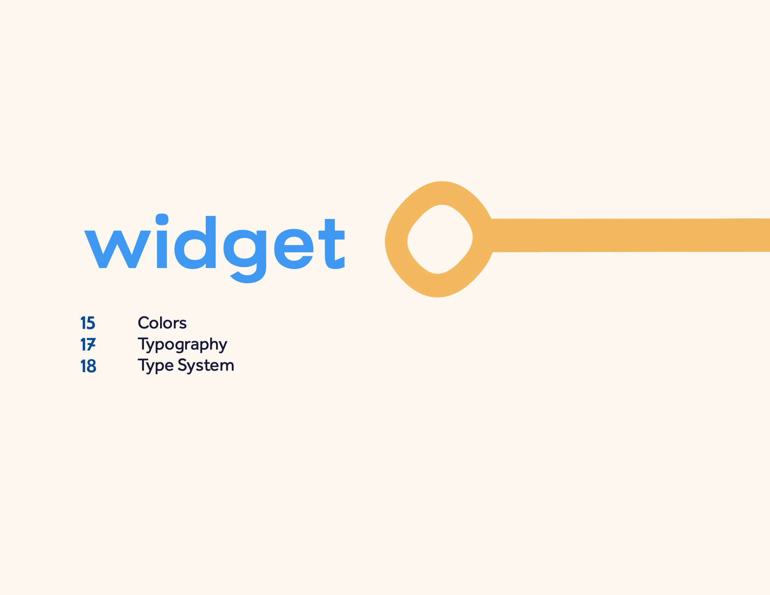
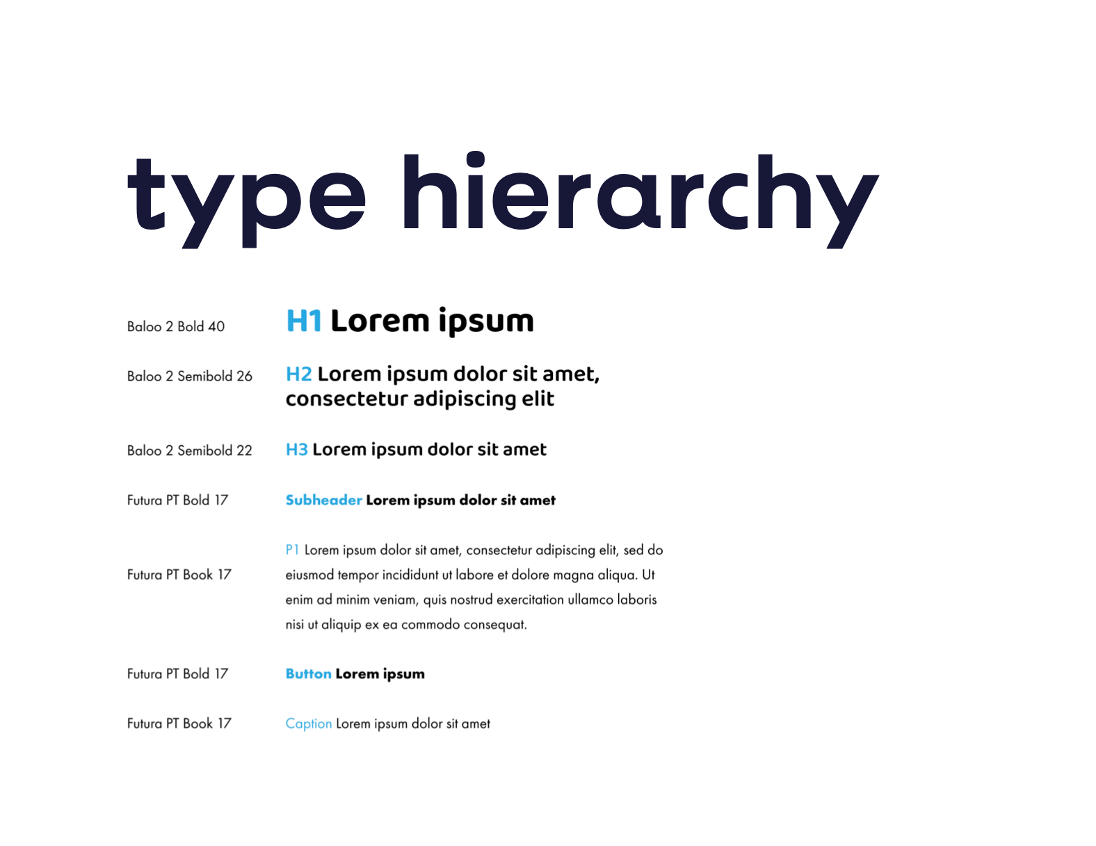
The main project deliverable was a working prototype of the primary user flows for the widget. These flows are the quiz/question flow and point redemption flow, along with the homepage. Our clients were also interested in having us help them develop the Alia brand, with our main brand deliverable being a brand book that showcases the Alia brand colors, type system, and various logo marks.
First Steps
Competitive Analysis
My team looked up and audited some of Alia's competitors on the Shopify app store focused on rewards and customer loyalty. These widgets were Smile.io, Yotpo, Rivo, Loyalty Lion, and Bon Loyalty.
Competitive Analysis Findings
We discovered that most of these widgets were incredibly similar in design and function, and didn't have many standout features. While they had simple layouts, the UI was boring and uninspiring, almost clinical. Some included too much text on each page, and had confusing CTAs that made navigating the interface difficult. Additionally, the UI of these widgets were often very different than the websites that used them, leading to clashing colors and type that discouraged us from using them.
Based on this, we knew that we wanted Alia's widget to be colorful and bold, feeling warm and friendly without being overwhelming. We liked the idea of a simple UI, but knew that we would have to use color and interesting microinteractions to set Alia apart. Our clients also mentioned wanting businesses to have some level of customizability for the UI, which we agreed with to help integrate the widget with the business' website. Finally, we realized that our main focus would have to be on figuring out the best way to present all of the information, questions, and reward options visibly, but not cluttered.
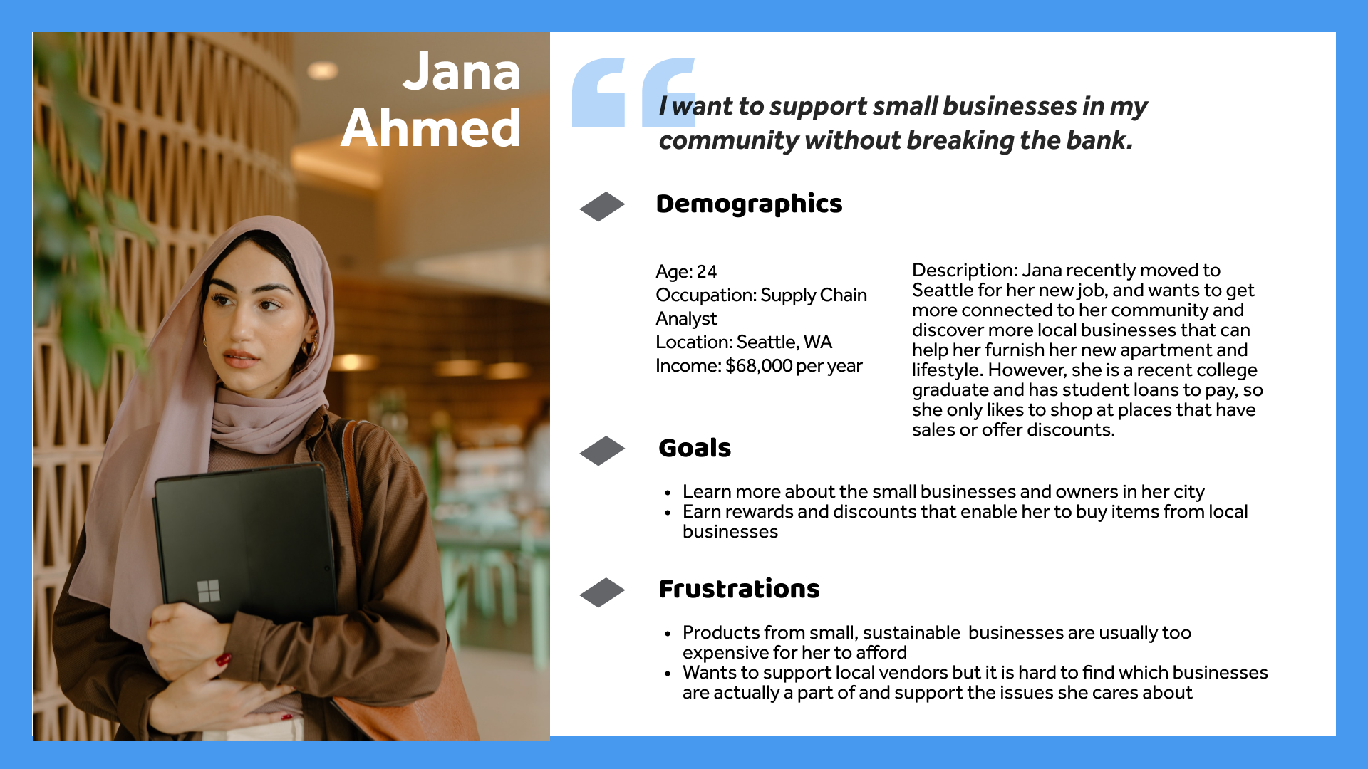
User Personas
We based our user personas off of the user base that our clients were interested in targeting. Their target users are young, working adults (ages 18-35) who are middle to upper-middle class (have enough money to be able to shop small businesses but not enough disposable income to purchase a lot from these places at full price) and interested in supporting mission-based sustainable businesses.

Sitemap
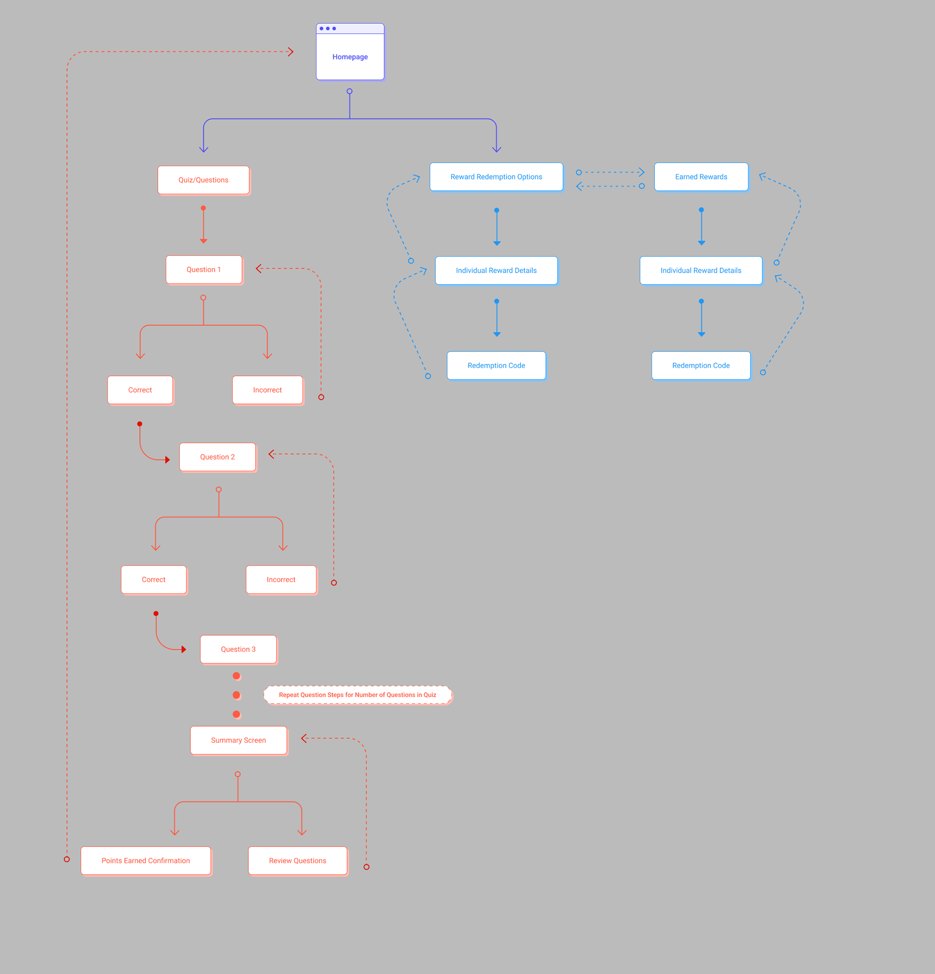
Alia Widget Sitemap
Developing Designs
Find all of our work on the iterations of our lo-fi and hi-fi designs and prototypes within this file:
The rest of this portfolio page will mostly highlight our finished prototypes!
Lo-Fi Designs
Highlighted Features
Our major challenge with this project was figuring out how to clearly communicate and keep accessible large amounts of information on the widget while still having a simple and clean UI. Unlike mobile devices, the widget is displayed on top of a website, meaning that Alia's content and UI will be competing with the information on the website to attract the users attention.
Additionally, a core function of the widget is having users read a short paragraph of text or image relating to the business' message or brand, then answering a few questions about what they just read. My team decided that users should be able to go back to the reading and refer to it when answering the questions, as we didn't want users to feel pressure or stressed out when completing the quizzes. Once deciding this, we needed to design a way for users to be able to easily switch between the reading and the questions. We discussed different options, including a button taking users back a page to the text when needed, a button to access the text with a popup, and just including the reading and the questions on the same scrollable page. Ultimately, each of these options presented issues of readability, easy of use, intuitiveness, and simplicity.
The design we ended up choosing was one that utilized a popup-like screen that could slide up to reveal the question, and slide back down to reveal the text. By presenting the reading and question on different screens, it separates the content so that it is easy for the user to digest and navigate. But, the reading and question are are still layered in a way that users intuitively understand how to quickly navigate between them.
The other major challenge was more conceptual, as our clients gave the team a lot of freedom in deciding how the logistics of the quiz would work. We debated whether user should be able to try a question multiple times, skip a question and go back, have a chance to see their answers at the end of the quiz, etc. Our final decision was to give users a finite number of attempts to answer a question, with the number of points decreasing with each incorrect attempt. We didn't want to cause the users stress when answering a question, but we also wanted to provide them with an incentive to get the answer right the first time, rather than just randomly choosing an answer. Additionally, given that many businesses using Alia might want to create questions that build upon each other, we wanted users to go through the quiz in order, or at least make an attempt to answer before skipping. Finally, we thought that having a review section at the end of the quiz would be a good idea, so users could be able to skip questions and go back to them if they really couldn't answer them initially.
Redemption Flow Variations
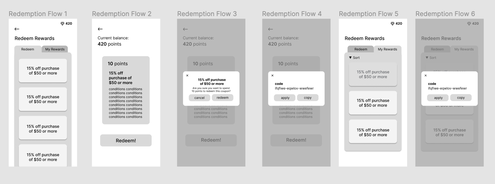
Version 1 of Redemption Flow (Redeem Points)

Version 2 of Redemption Flow (Redeem Points)

Version 2 of Redemption Flow (View an Earned Reward)
Lo-Fi Prototype of Home Page and Question Flow
Hi-Fi Designs
Since Alia will be launching through Shopify, our clients requested that our designs be made using components from Polaris, Shopify's very own design system. Check out our design system and created components here:
Changes from Lo-Fi to Hi-Fi
As we moved from lo-fis to hi-fis, our main challenge was finding components to use from Polaris that would fit the style and needs of our designs, which led to us making some minor changes.
In the quiz flow for our lo-fis, the fill of the entire popup frame of the question would change to either green or yellow when an answer was submitted to indicate if the answer was correct or not. When we showed this in a crit with other designers, they felt it was too bold and distracting, and would clash with a "clean" UI. So, in our hi-fis, we replaced the fill with a bold gradient stroke in either green or red-orange, as it still created a clear divide between the reading screen and the question popup, but wasn't too loud or distracting. This kept our interface looking clean while still giving users a clear indication of whether their answer was right or wrong.
Additionally, we used circular progress indicators on the rewards page to show users how close they were to having enough points to earn that specific reward. However, Polaris doesn't contain a component in this shape, so for the engineers to develop this screen, we decided to use the standard progress bar and place it below the reward description and favorite button.
We also decided that when businesses are setting up their widget, they'll be able to customize the main color of the widget to better fit their brand and integrate with the overall style of their website. In our prototype, we chose to represent this color with the main blue we chose for Alia's brand, so anywhere this blue is shown on the widget would be able to be changed by the brand. Though it is only one hue used, to differentiate different elements, we chose to use this color at full opacity in some places and 40% opacity in others. This system would translate for any color a brand chooses as well.
We also had to make an adjustment to partial points earned with multiple attempts on a question. The developers weren't able to figure out how to implement that feature, so our clients requested that we remove partial points for the time being and allow users unlimited attempts to answer a question.
Check out the hi-fi prototype of our home page, quiz flow, redemption flow, and a mockup of the widget on a website:
Hi-Fi Prototype
Branding
Brand Elements
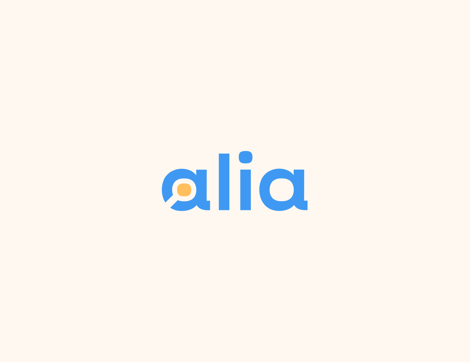
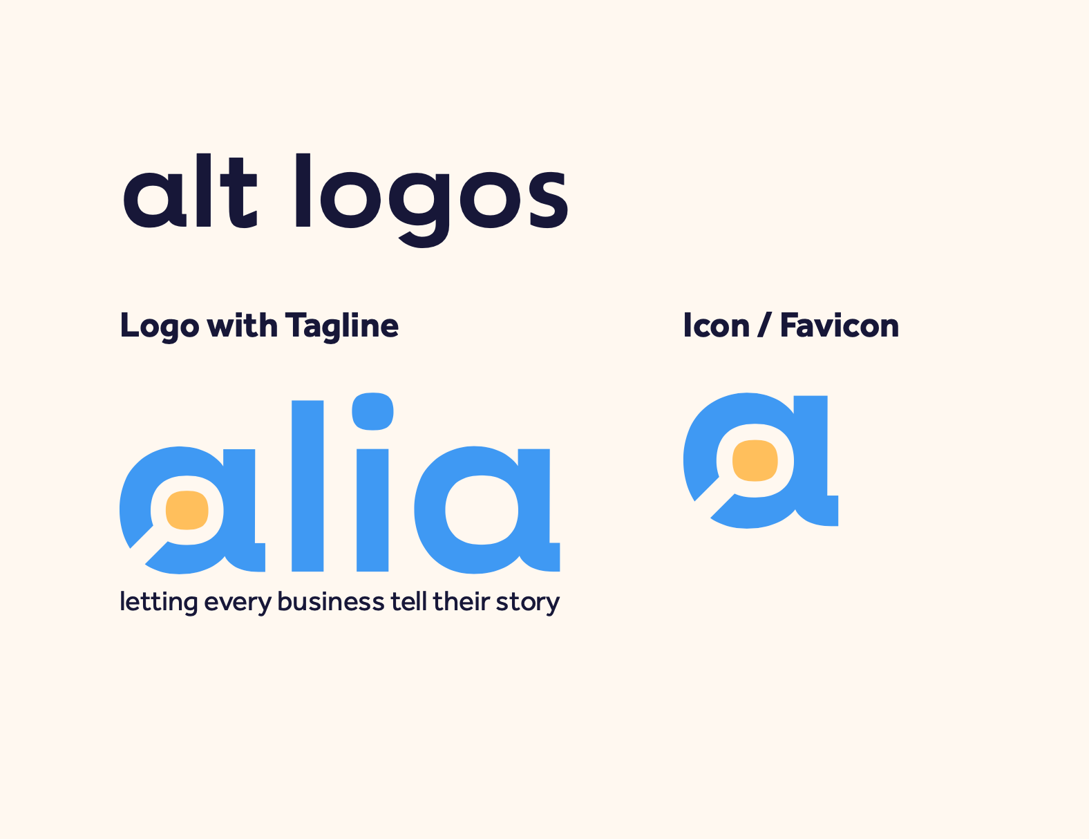
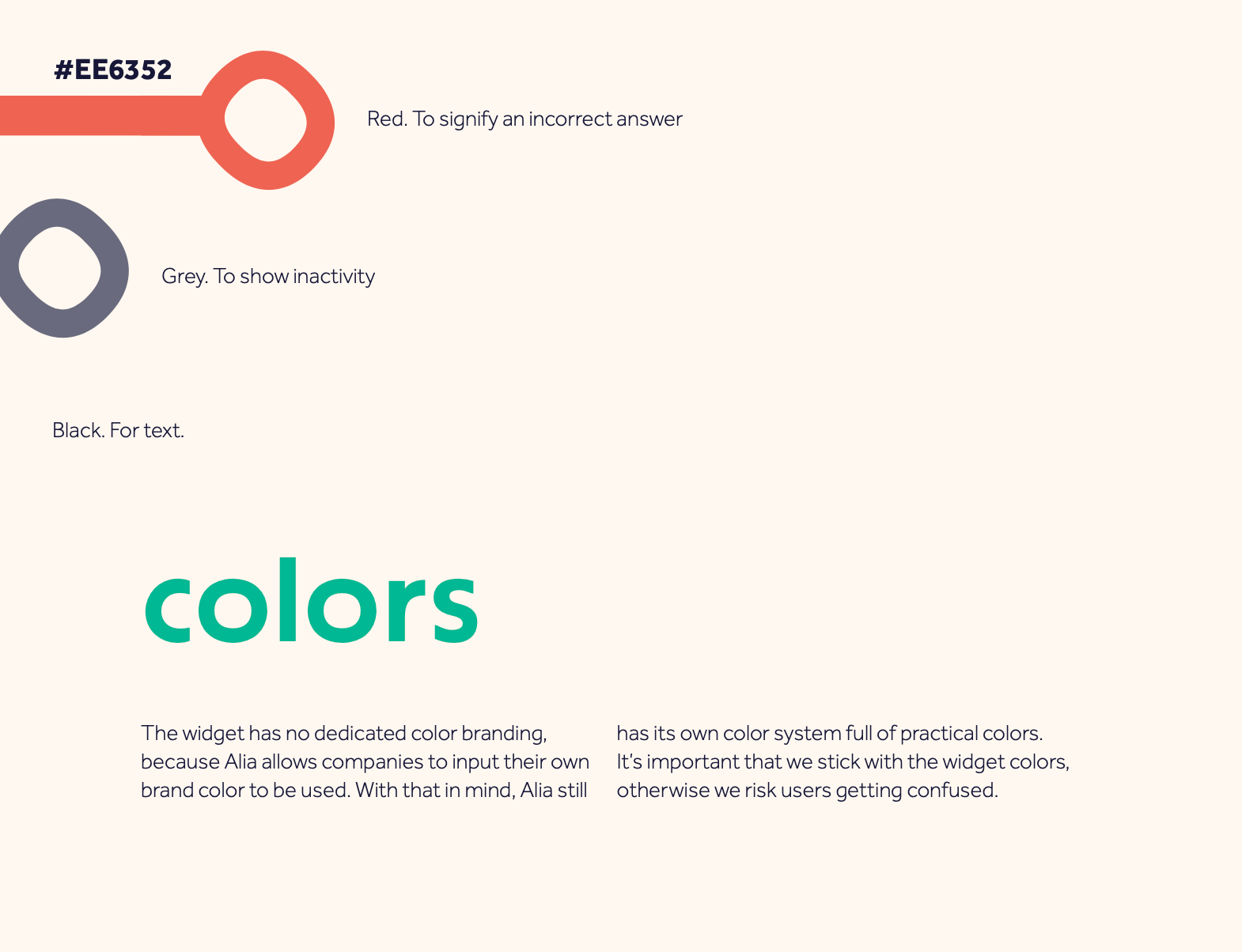
Our clients wanted a logo and brand that was bold and fun, while still maintaining the essence of a tech company. The Alia brand makes use of a bright blue and yellow, with a simple logo mark of the signature "a" making use of negative space to create a magnifying glass inside of the letter. Alia is all about discovery and learning, and we wanted to make this a key feature of the brand.
Check out our brand book:


What's Next for Alia?
We presented our hi-fidelity prototype and brand book at our end-of-semester showcase and received very positive feedback from attendees and our clients, who were very grateful to my design team for helping them bring their passion project to life. After showcase, we handed off our prototype and components to the Alia team, along with the brand assets for them to expand upon as Alia grows. The rest of the Alia team is currently working on implementing our designs and getting ready to launch in May 2023!