Client: College of Engineering, Northeastern University
Role: UI/UX Designer
Date: August 2022 - Present
What is Sandbox?
Sandbox is a student-led software consultancy at Northeastern University that specializes in creating web and mobile apps to improve students' experiences using and navigating Northeastern's resources. 
Project Summary
Problem Statement
With the robust nature of the Northeastern co-op program, students get the opportunity to work at a wide variety of companies, some who have offices outside of the metro center of Boston and are not easily accessible by public transportation. For students who don't have cars or cannot drive, it can be difficult to find people to carpool with who also live near them. Even for students with a car to commute, it can be expensive and not worthwhile to drive every day without sharing the cost of gas or tolls. 
Proposed Solution
A new website exclusive to Northeastern students, where they can connect with other students who are looking to carpool to their co-ops.
Deliverables
UI and prototype of the CarpoolNU website, including all of the main user flows for both riders and drivers. I will also be creating a simple logo mark for CarpoolNU. A reach deliverable by the time of the alpha release is adapted designs for tablets and mobile phones. 
Ideation
Users
Our primary user base is Northeastern students who are currently on co-op or are about to start. These students likely work in offices outside of the metro center of Boston, which are either difficult or impossible to commute to by public transportation. 
•Some students have their own car to drive to work with empty seats, but don't want to pay for gas by themselves
•Others students don't have access to a car or can't drive, but still have to go to work in-person​​​​​​​
User Personas

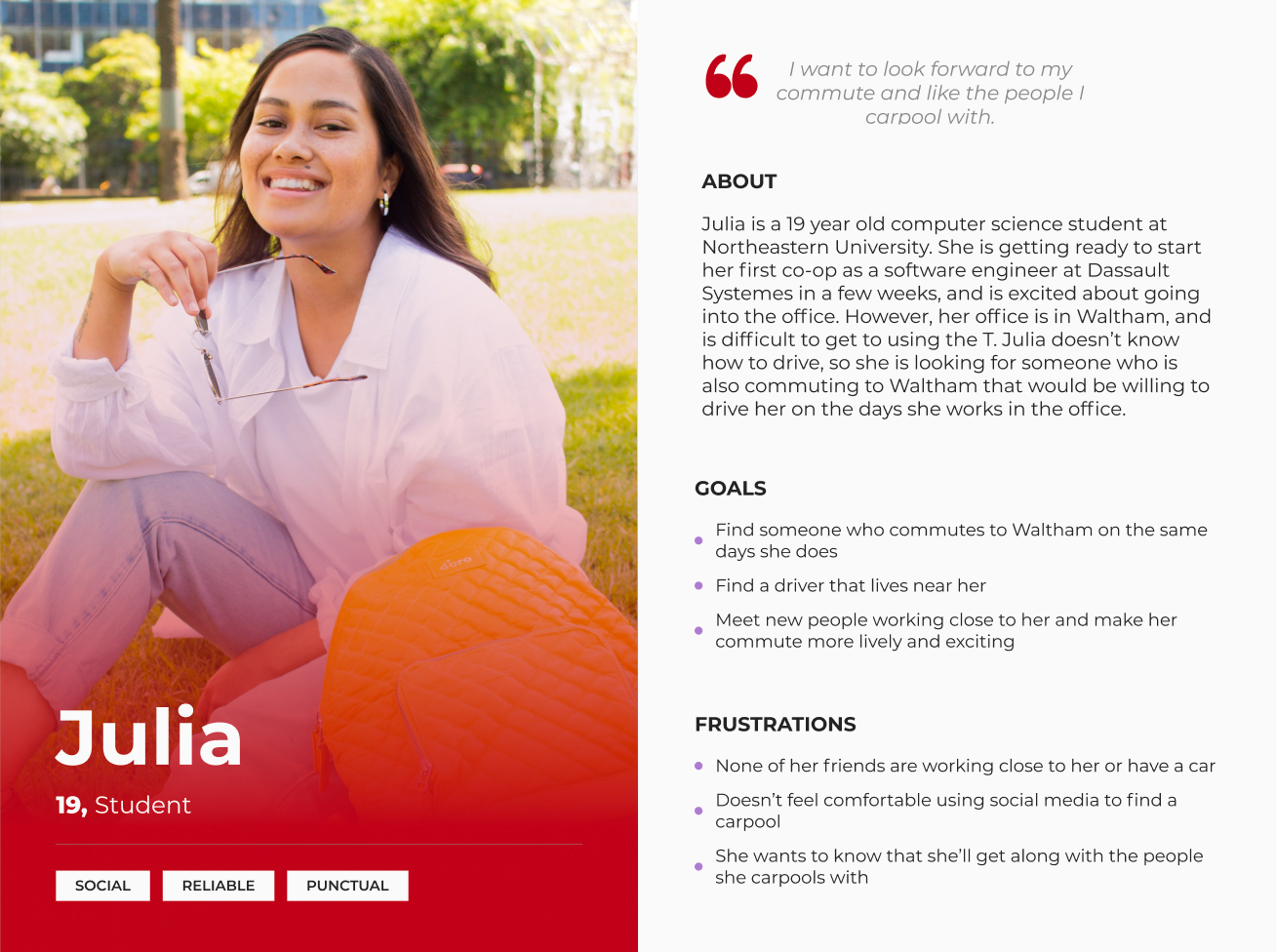
Persona for a potential rider

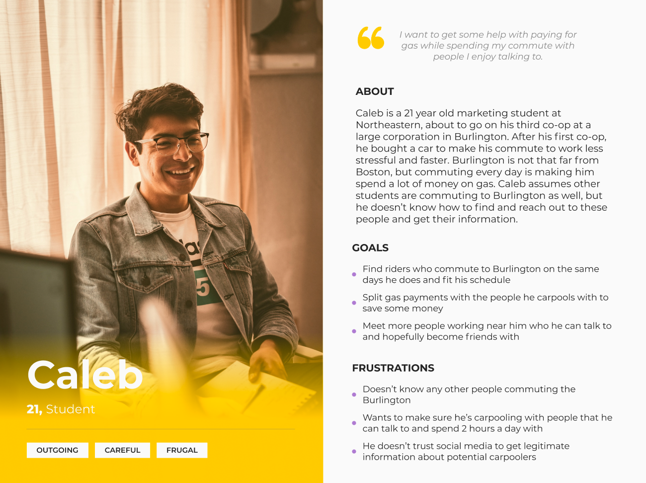
Persona for a potential driver

Sitemap

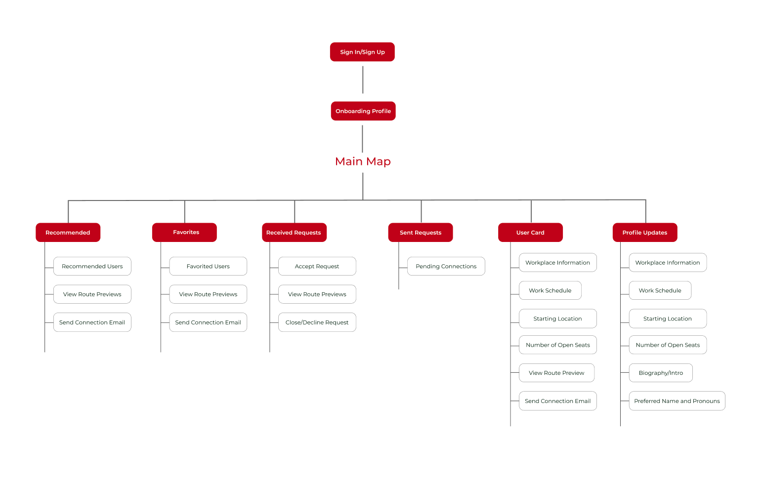
Sitemap for CarpoolNU website

Designs and Deliverables
Features and Pages
1. Onboarding screen where the user enters their personal information and work schedule to create their profile. This same page layout is used for the edit profile page on the main interface.
2. Main home screen with map showing other users as well as a collapsible side panel highlighting the profiles of rider or driver recommendations that match the user's profile. Users can also favorite another profile, or send a connection request to a user they are interested in carpooling with. On this map, users can click on a pin to view a user's profile card and send them a request, even if that user isn't shown in their recommended users tab.
3. Nav bar where users can click to see their recommendations, pending connection requests, or edit their profile.
4. Side bar where users view a list of profiles they have sent a connection request email to or received one from.
5. A popup after clicking CTA to send a connection request that allows users to send an email to the person they want to carpool with. CarpoolNU will send the email directly from the website to the recipient's Northeastern Outlook account that they used to sign up for the site. The text of the email is meant to give the recipient an introduction to the person sending them a request, and connect them via email to communicate further. The text is autofilled with the bio the user entered during onboarding so they don't have to rewrite the email to every person they send a request to. This makes it quick and easy to send a request, but users have the option to edit the content of their message if they choose to.​​​​​​​​​​​​​​
Lo-Fi Designs
Initial Ideas for Onboarding Profile Page

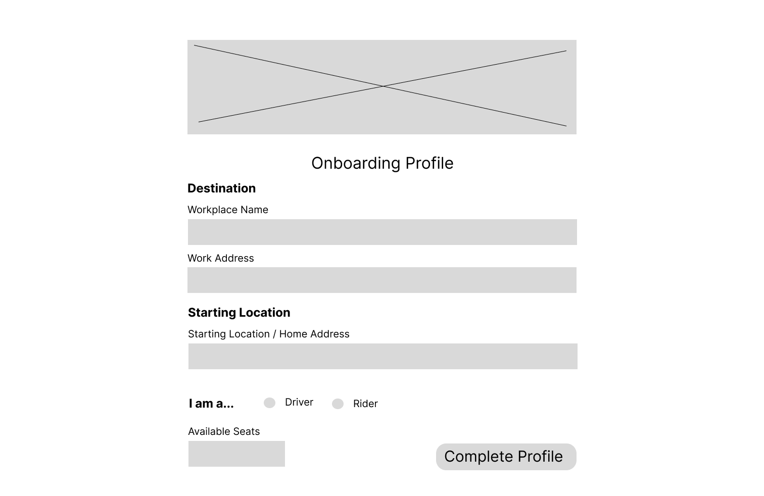
Onboarding Page Version 1

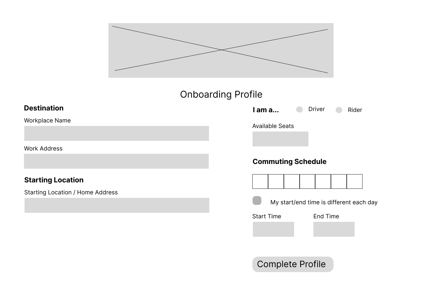
Onboarding Page Version 2

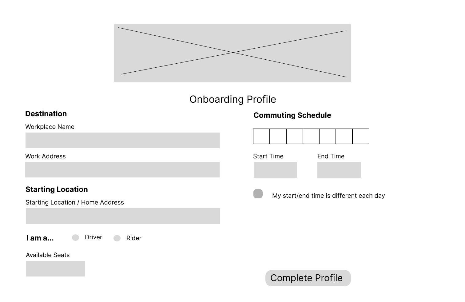
Onboarding Page Version 3

Selected Version of Onboarding Page

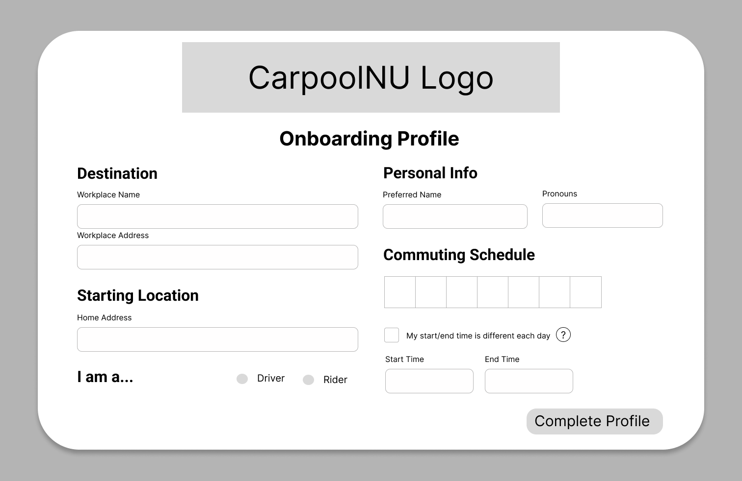
The onboarding layout I ended up using was similar to the earlier versions I experimented with

Initial Ideas for Layout of Main Map UI

Main Landing Page Version 1

Main Landing Page Version 2

Main Landing Page Version 3

Selected Version of Main Map Layout

I chose to use Version 1

Main Landing Page Map when a pin has been clicked on
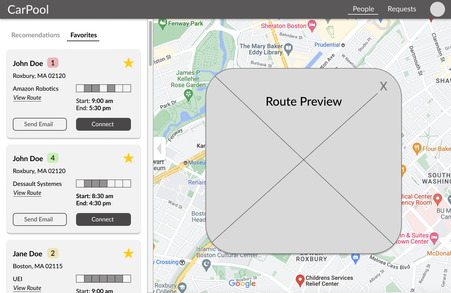
Additional Lo-Fi Pages

Route Preview Popup

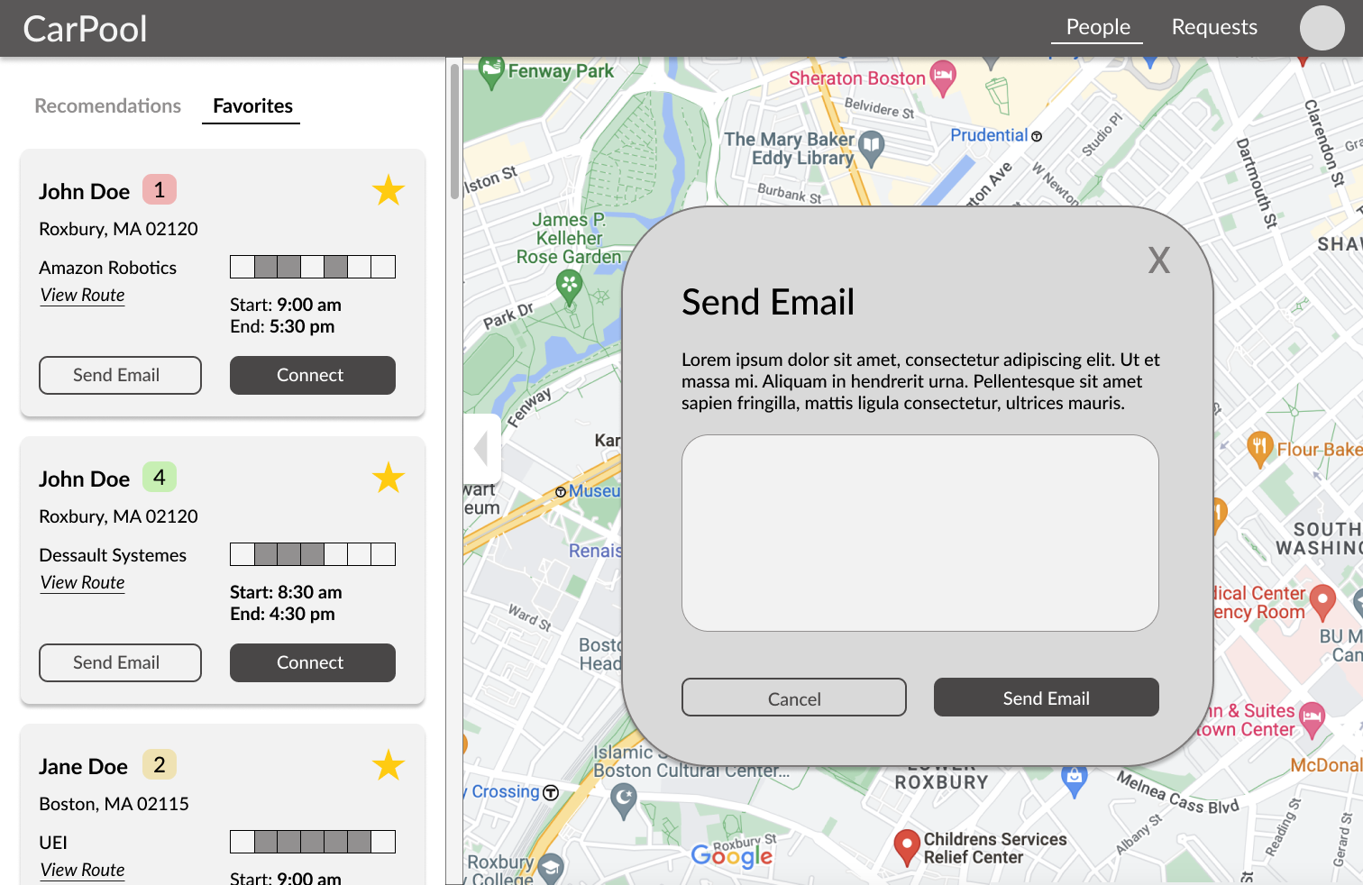
Connect with other users by sending an email to them
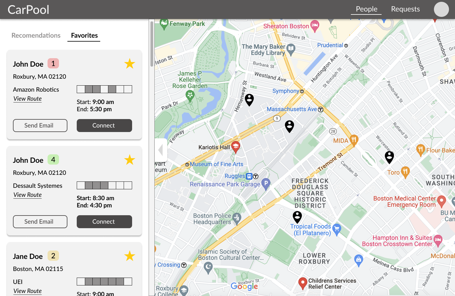
Favorites Tab

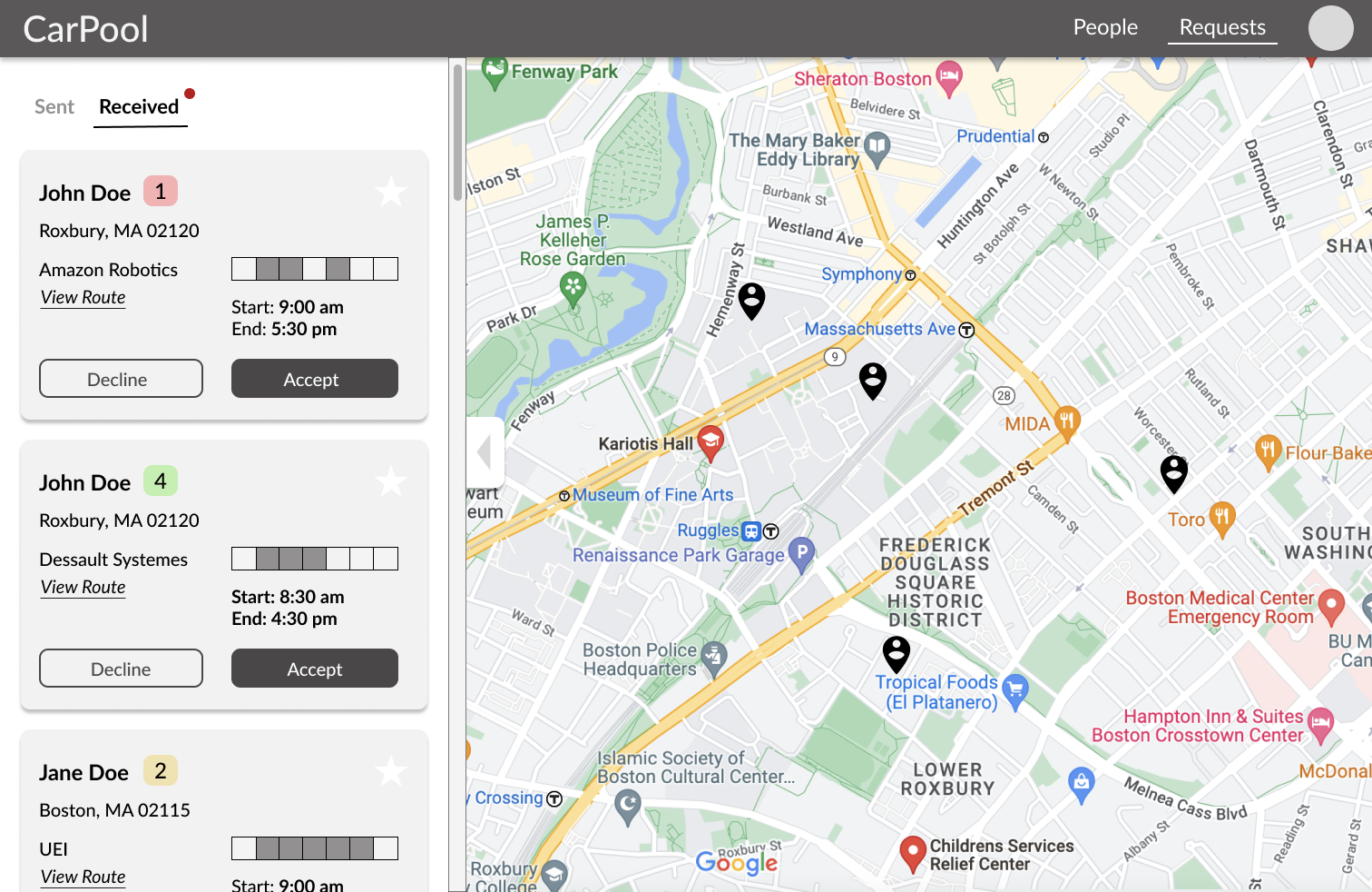
Received Connection Requests Tab

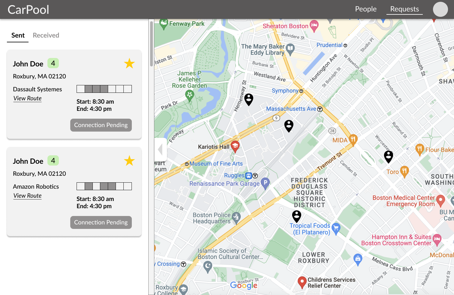
Sent Connection Requests Status Tab

Hi-Fi Designs
Hi-Fi Edits
Minor edits were made to the tabs on the nav bar and user profile cards based on feedback from other designers and the developers on the team. While we initially intended to make sending a connection request and sending an email separate features, ultimately we decided it was more valuable to require users to send an email so that recipients of a request will always get a bio and better idea of the people who request them, hopefully leading to better carpools. Additionally, on the profile card, users can see a preview of the person's route to work. Originally a smaller, less visible button, in our hi-fis we made this more prominent for users to see and click on. We also added color to the site, keeping it simple with mostly red, black, and white for the brand to show a strong connection to Northeastern University colors. Some other system interface colors we are using are green, yellow, and another shade of red to highlight different aspects of a user's profile, such as the days they commute to work and how many seats left a driver has in their car.
Onboarding Page (Blank and Error)

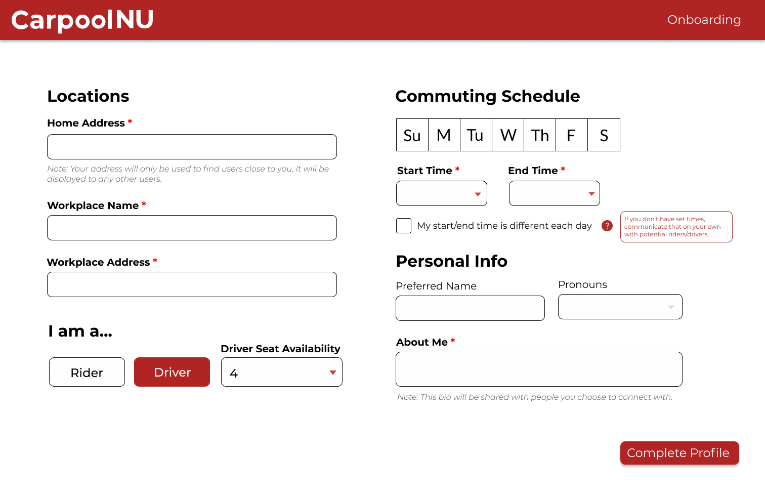
Onboarding Page for Driver (mostly blank)

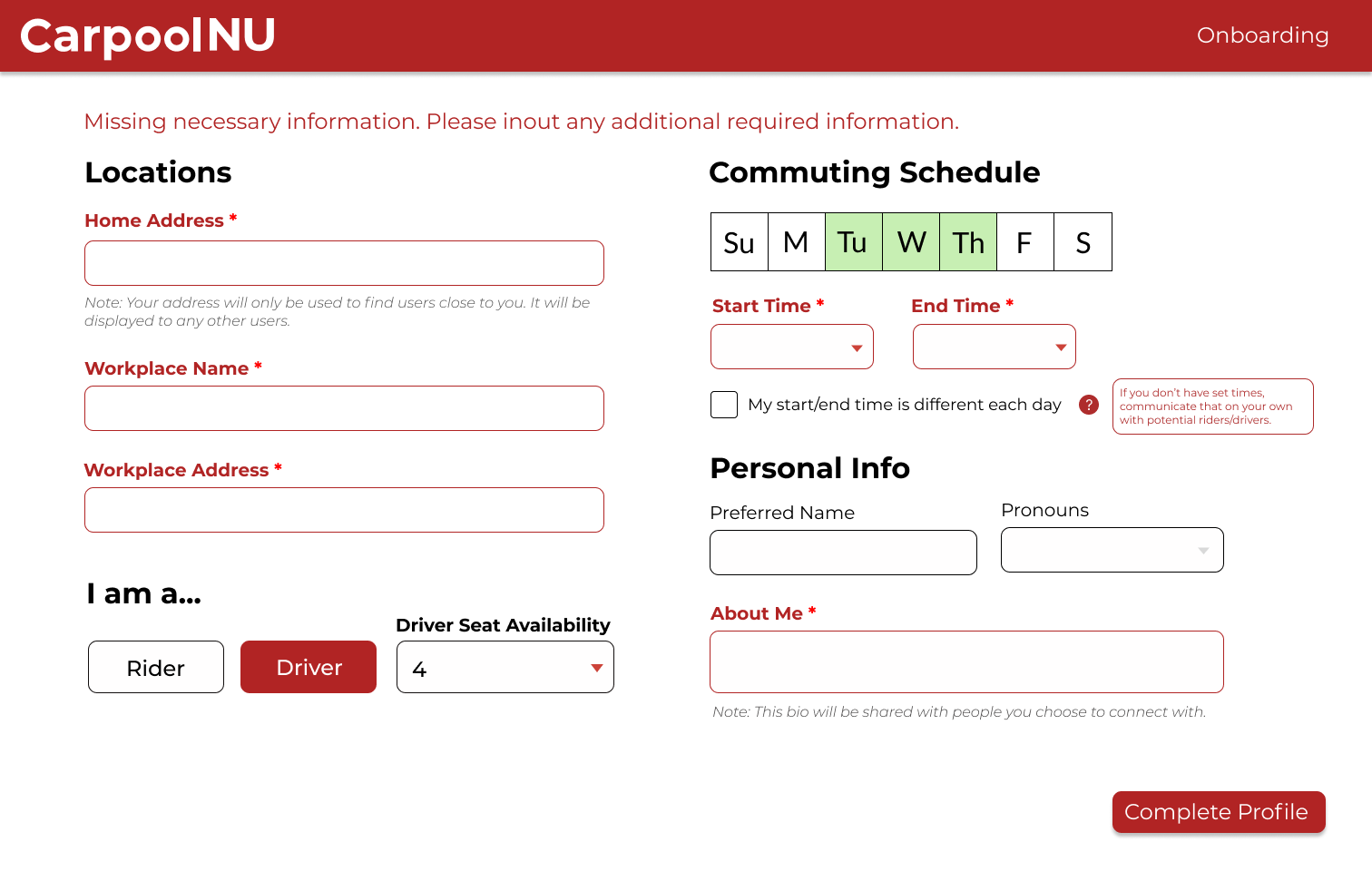
Onboarding Page Error States (when not all required information is entered before hitting complete)

Main Map Pages (Rider View)

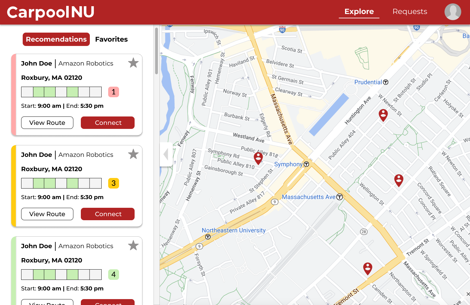
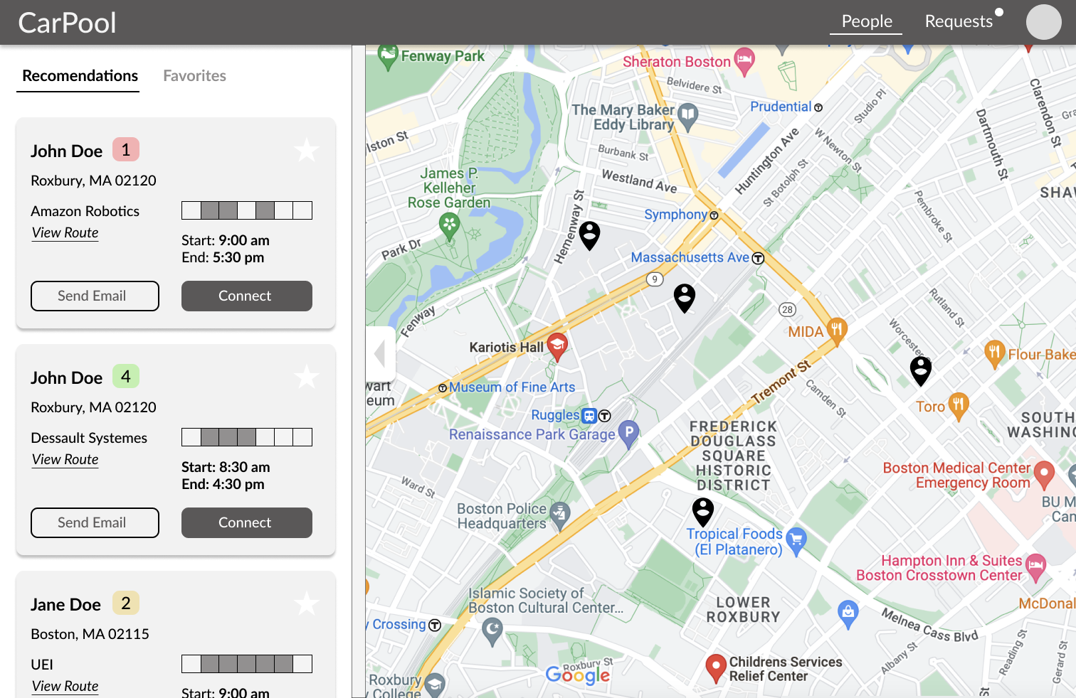
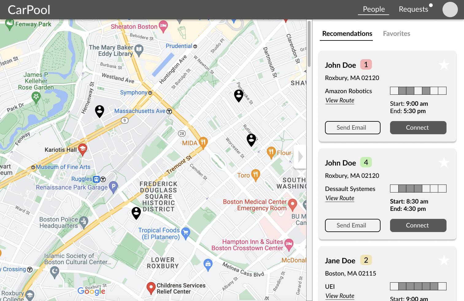
Initial landing page after users log in or complete onboarding - map with side panel showing recommended users 

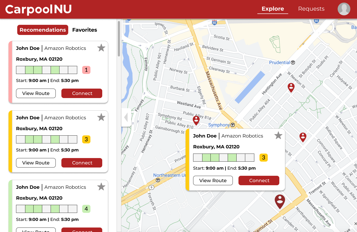
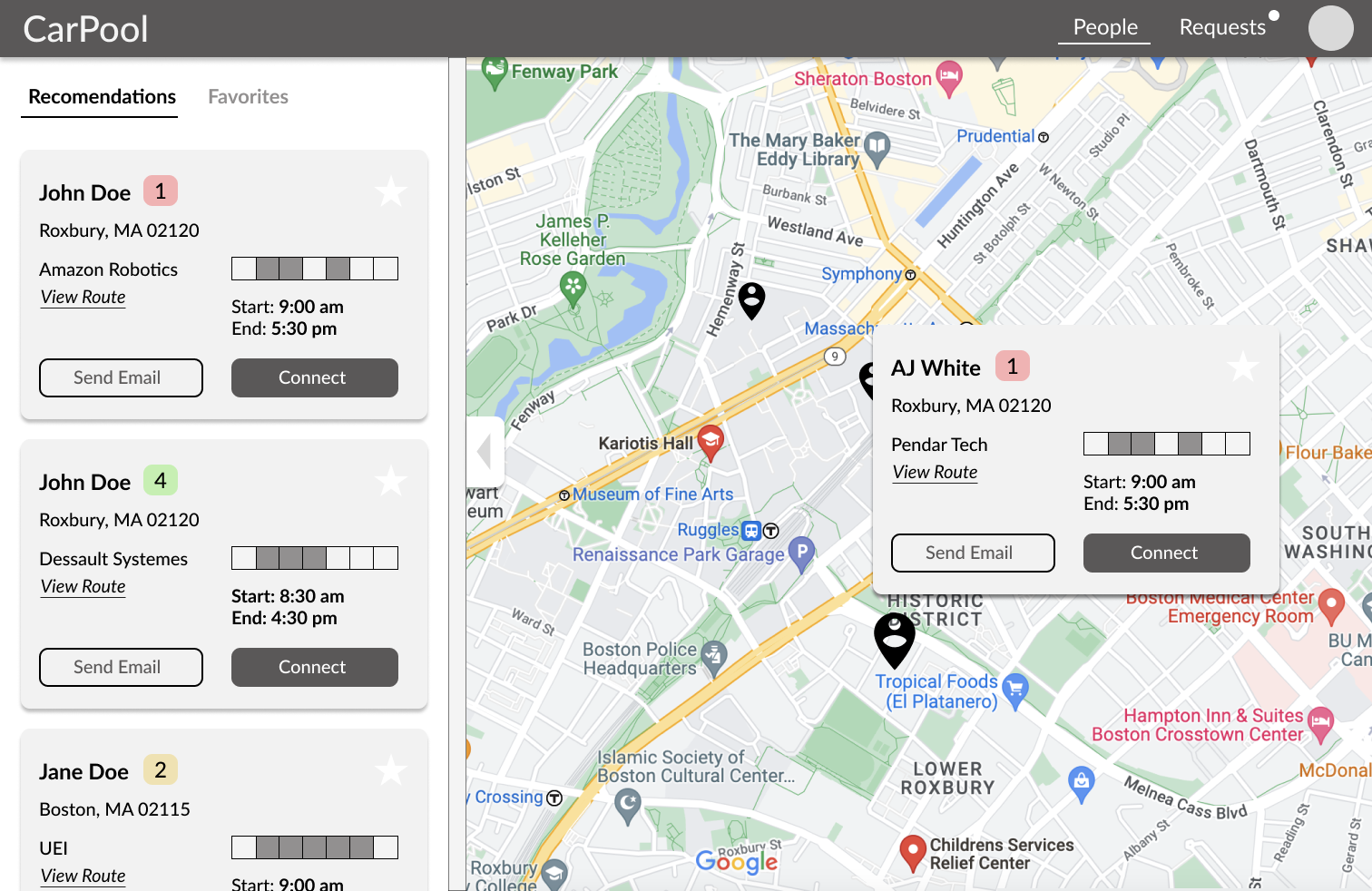
Users can click on a pin on the map to see any user's profile and connect with them - they can scroll or click anywhere else on the map to make the card disappear

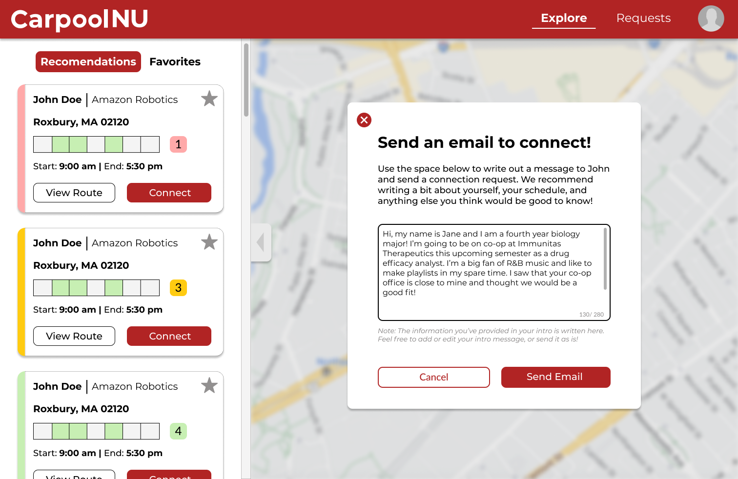
Screen where users can see their populated message and edit it before sending a connection request email

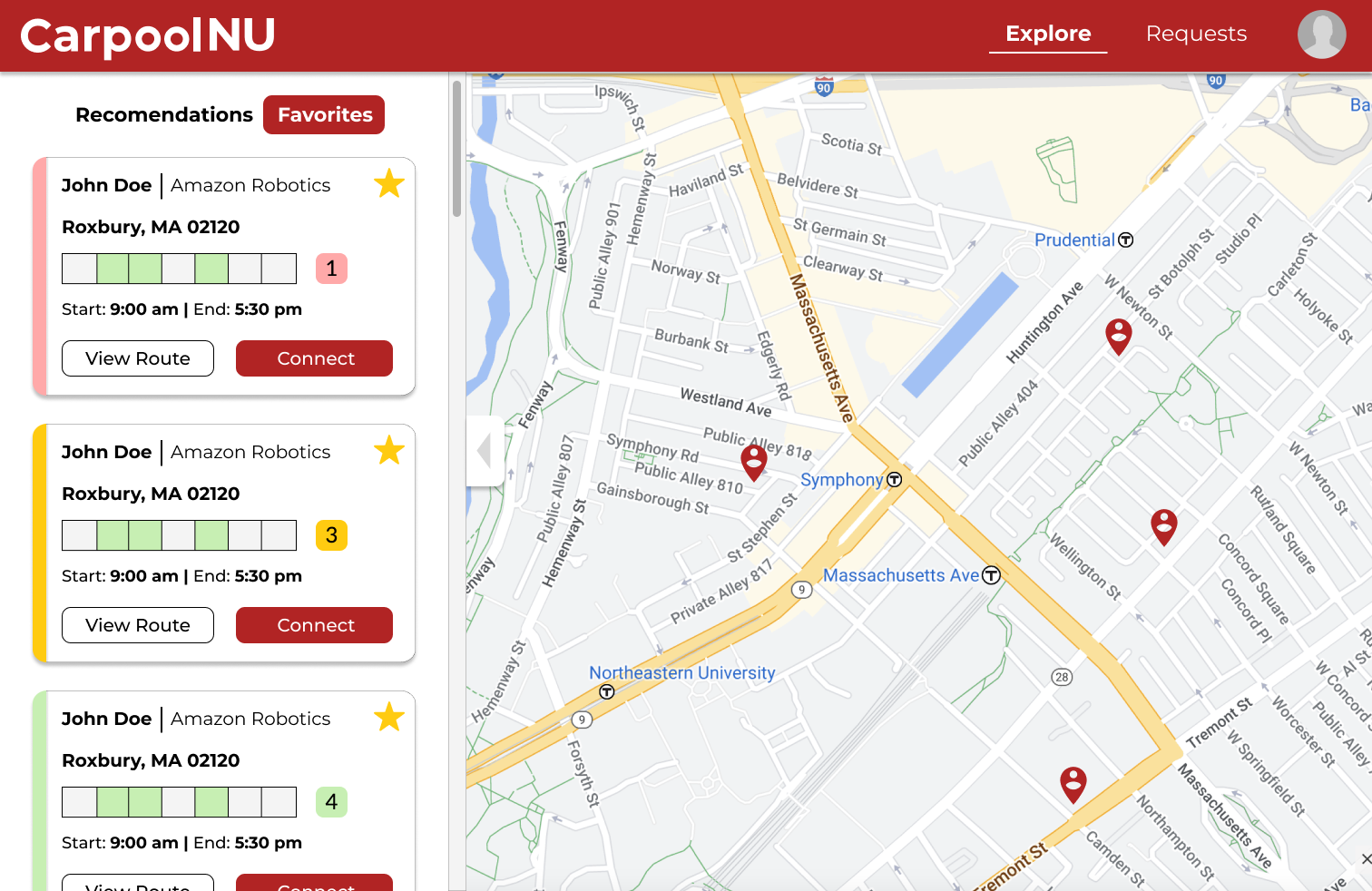
Users can favorite any user card and see them in the favorites tab

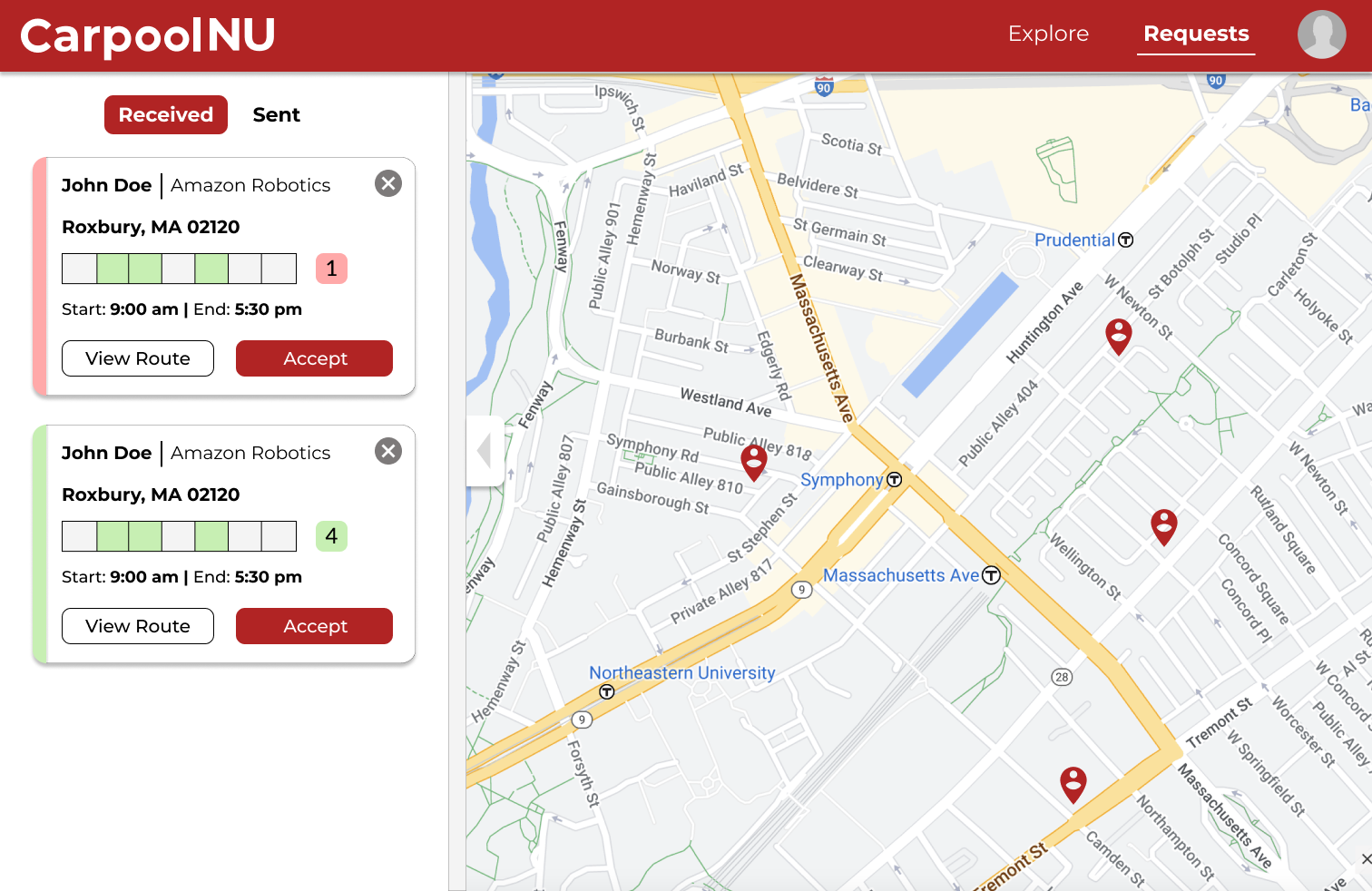
Option to accept a connection request or decline it (by hitting the close button) in the received requests tab

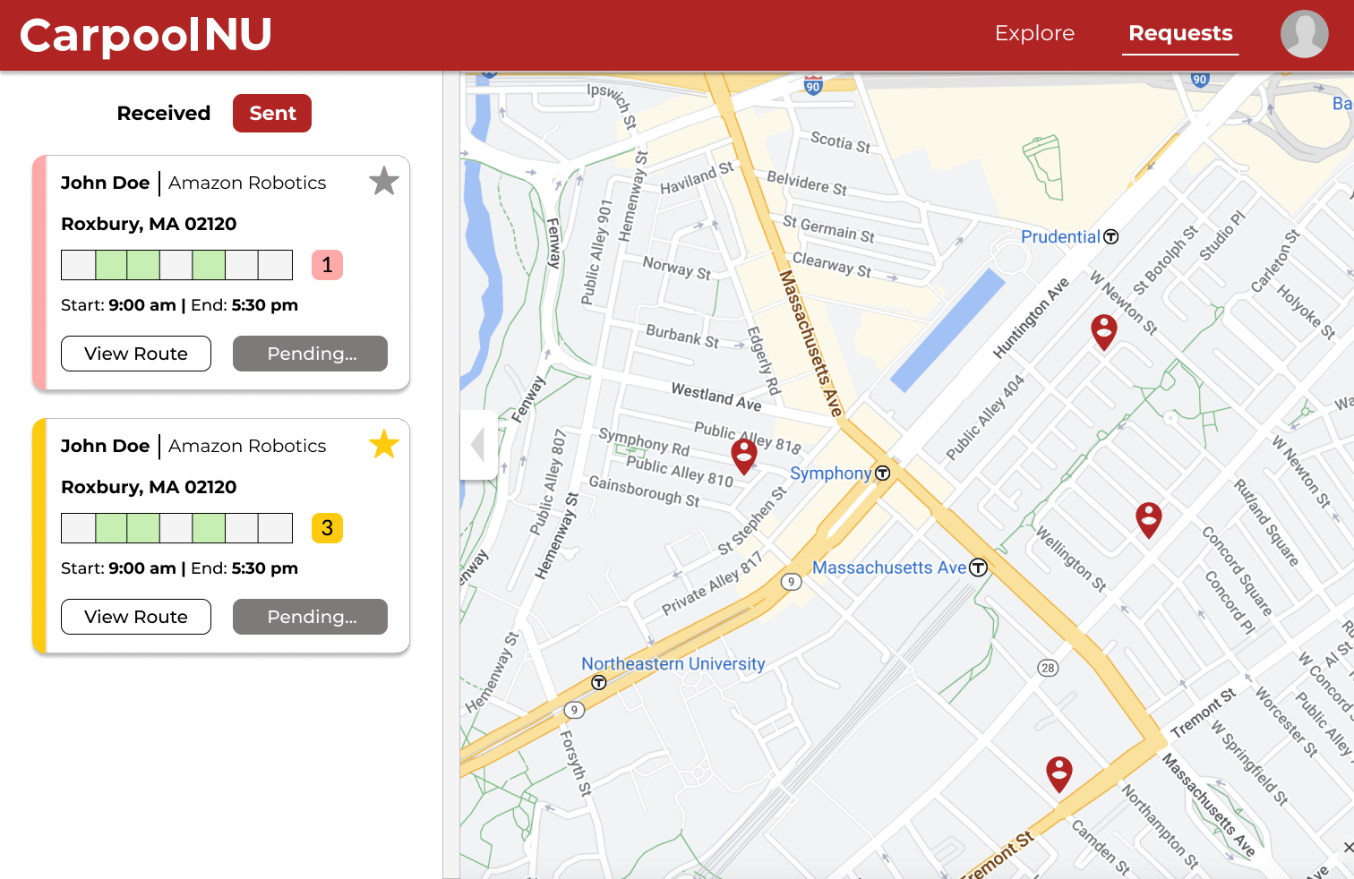
Users can see what requests they've sent out and the status of those requests in the sent requests tab

Updates In-Progress and Next Steps
As I finish up the edits to the hi-fi designs and link the pages to create a prototype, the team is going to begin user testing to get feedback on the interface. From there, I'll make adjustments as needed so CarpoolNU can hopefully launch in May 2023. I will also be working on creating a more definitive color system and brand for CarpoolNU, including a logo. We also hope to eventually have a custom landing page (rather than a standard Google and Outlook sign in) and adapted designs for tablets and mobile phones, which I am currently starting work on as well.​​​​​​​

You may also like

Back to Top