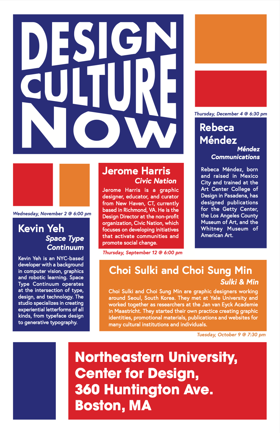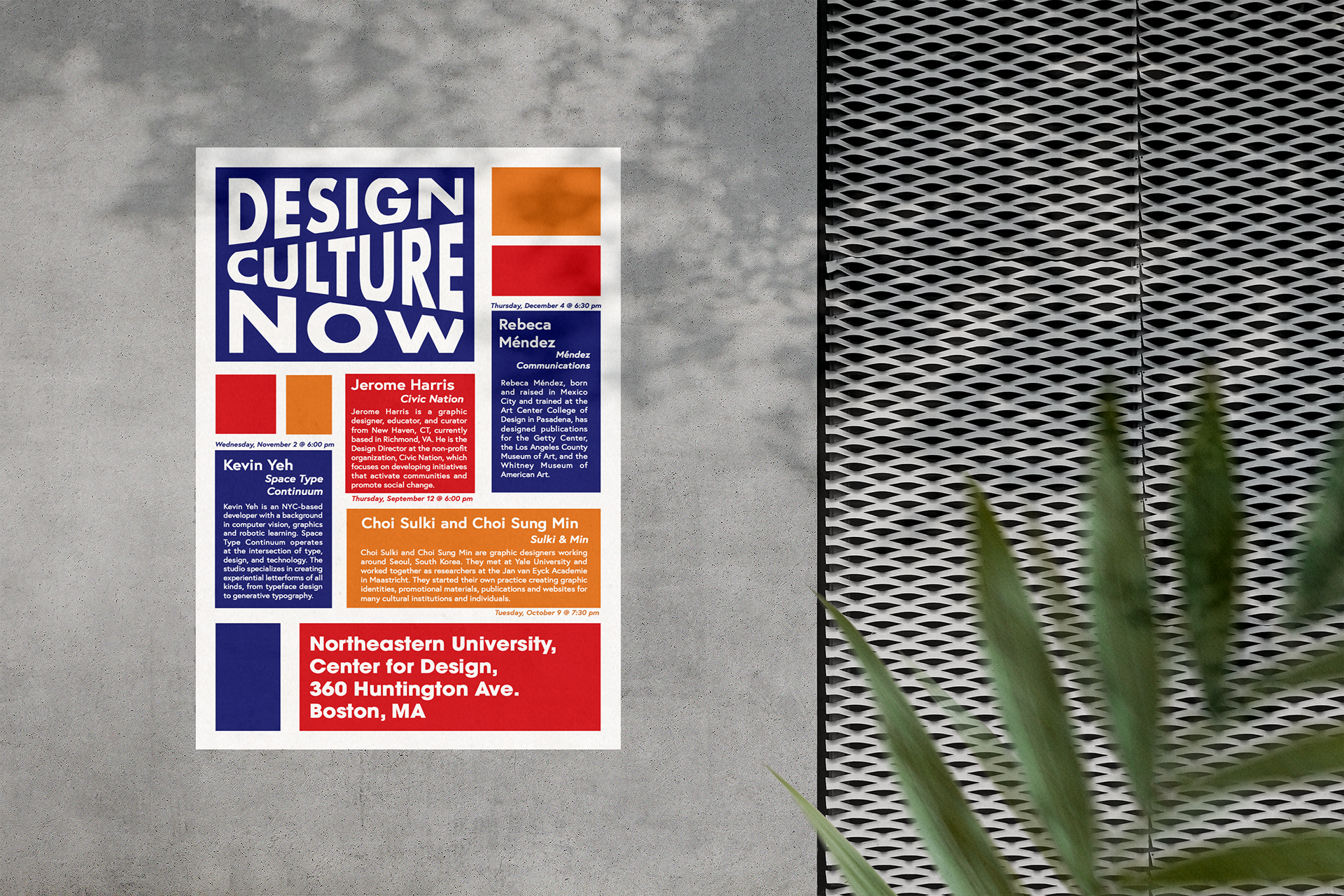
I was tasked with designing an 11 x 17-inch poster for a fictional lecture series about contemporary design, making sure to pay close attention to the typographic hierarchy of information and readability. My poster design was inspired by Piet Mondrian's pieces and I created a grid system to lay out my boxes and used color-blocking to create a modern, eye-catching poster that would pop when hung on a wall.
I wanted to catch the viewer's attention, and I felt like smart use of bold, contrasting colors could do that very effectively, which is why I decided use blue, red, and a yellow-orange. The colors had to be bright, but also bold enough to contrast with the white text so the information could be properly read. Even though the Mondrian style isn't exactly a modern idea, I thought that the clean lines, with some added white space, would make for a clean and sleek design that could appropriately capture the essence of contemporary design. I also chose this specific design for the title because it gives the phrase emphasis, and the unique design draws the reader's attention to it immediately, allowing them to read the title of the event before reading the rest of the supporting content.