Our website is now live! Check it out here!
Client: Generate Product Development
Role: Designer
Team: Alex Lian, Rachael Kam, Duy Tran
Date: January 2022 - May 2022
What is Generate?
Generate is Northeastern University’s student-led product development studio. It contributes to the growth of start-ups at Northeastern University by educating engineers, designers, and entrepreneurs about product development and the integration of business and engineering.
Project Summary
A new Generate website with an easier user experience for updating content. With a focus on showcasing the diversity of opportunities at Generate and to function as the main location for students and clients to apply.
Problem Statement
Generate’s current website is outdated in content (branding, images, copy) and difficult to maintain. It does not immediately showcase the variety of roles Generate offers, and leads users to believe that the organization is primarily geared towards only engineering and computer science disciplines.
Proposed Solution
Build and design a new website from the ground up that can be easily maintained by people even without coding experience. Immediately communicate to the audience we are more than a product development studio with the brand, layout and content. Make site easy to navigate and have all information and content easily accessible and understandable. Place an emphasis on the range of opportunities at Generate (design, business, communications, etc.) and a focus on teams and community.
Deliverables
Because this is a redesign of an existing website, we are focusing on editing and improving the main content pages: the Landing page, About page, and Apply pages for prospective student team members and future clients. These pages are integral to helping users navigate the site and guiding them to the information and applications they are looking for. We are also aiming to design additional pages from scratch, which will hopefully give users a more well-rounded view of Generate as an organization and community. These include pages dedicated to showcasing past projects, specific community events, information about different teams (and their current members) within the organization, and our timeline for developing products. We will also be updating the navigation bar and footer.
First Steps
Competitive Research
I worked with my design team to research and explore the websites of other product development and entrepreneurship organizations at Northeastern University, and define the qualities of their designs that we liked and would potentially like to build off of in our website, as well as navigate the sites as a user to see what aspects of the user flows worked well and which we felt were unsuccessful. From our research, we created a list of attributes that we wanted to focus on in our designs.
After performing competitive analysis, we finalized the intended user base and requirements for the fully updated website.
Competitive Analysis Findings
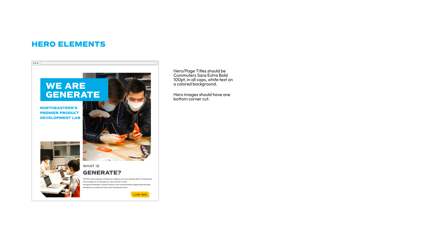
• Make impression with hero image
• Clear call to action
• Loud and clear menu
• Simple copy
• Breathable layout
• Effective use of white space (especially with our color palette)
• Hierarchy through typography and color
• Not just font weight, but also size
• Ample user feedback (buttons and hover states)
• Developed header and footer with links to all pages visible
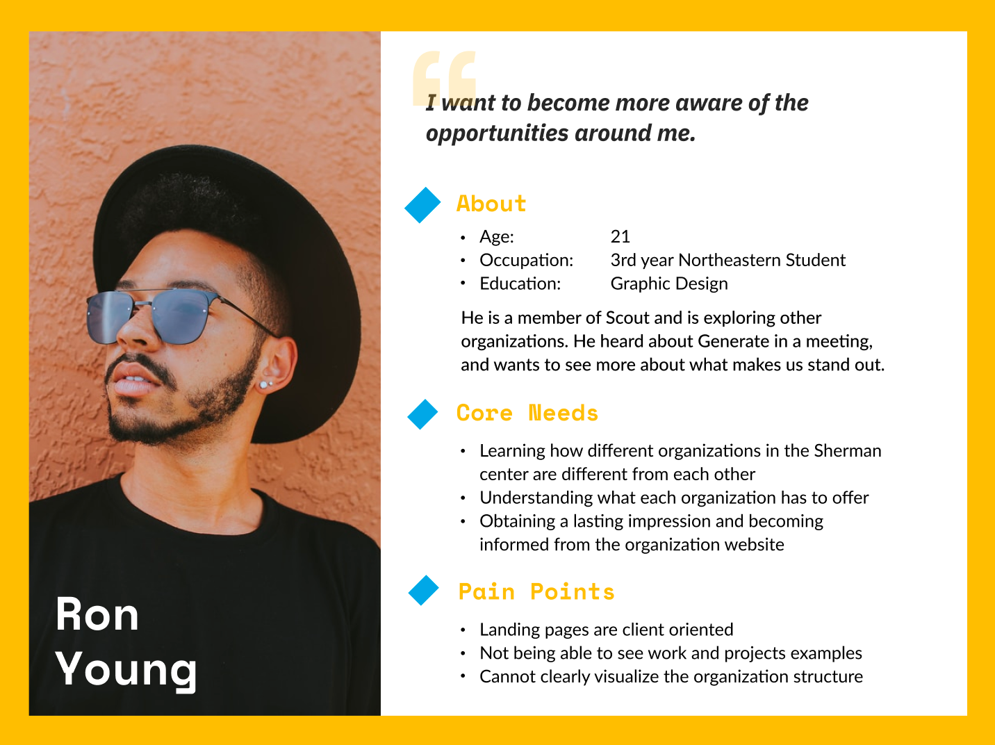
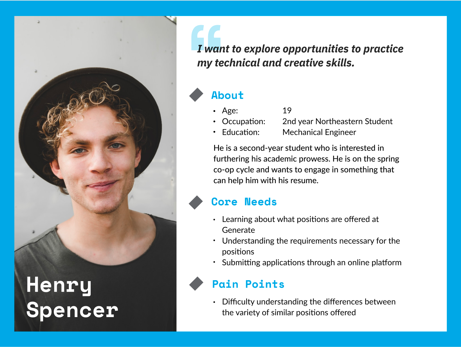
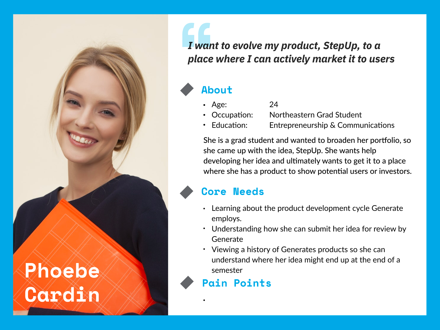
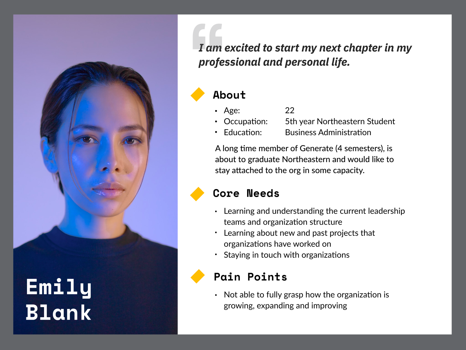
Users and Requirements
Users
• People who are applying - Students & Clients.
• New Generate community members
• Strangers who are interested in learning more about the org
• People looking for information - Already familiar (current members)
Supporting Designs
• Branding guidelines - colors, typography, marks
• Icons and graphics (for menu and more)
• Media assets - Photos, videos
• Application forms
Design Flows
• Information exploration flow
• New applications flow
• Information search flow
User Personas
Ideation
Style Guide
We referred to the style guide created by Generate's Executive Director and management team for the website to ensure that our designs are cohesive and match the Generate brand.
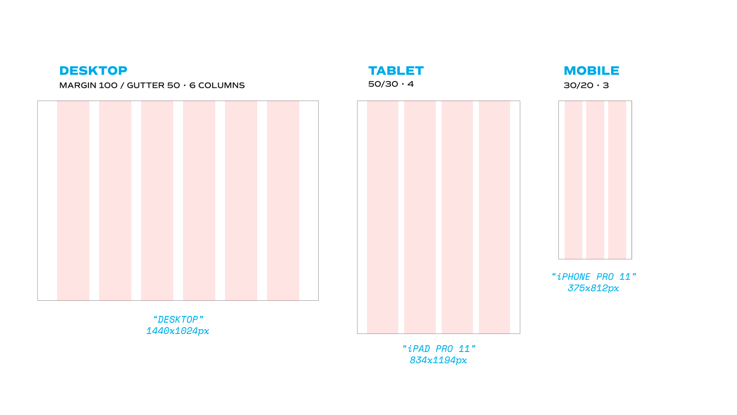
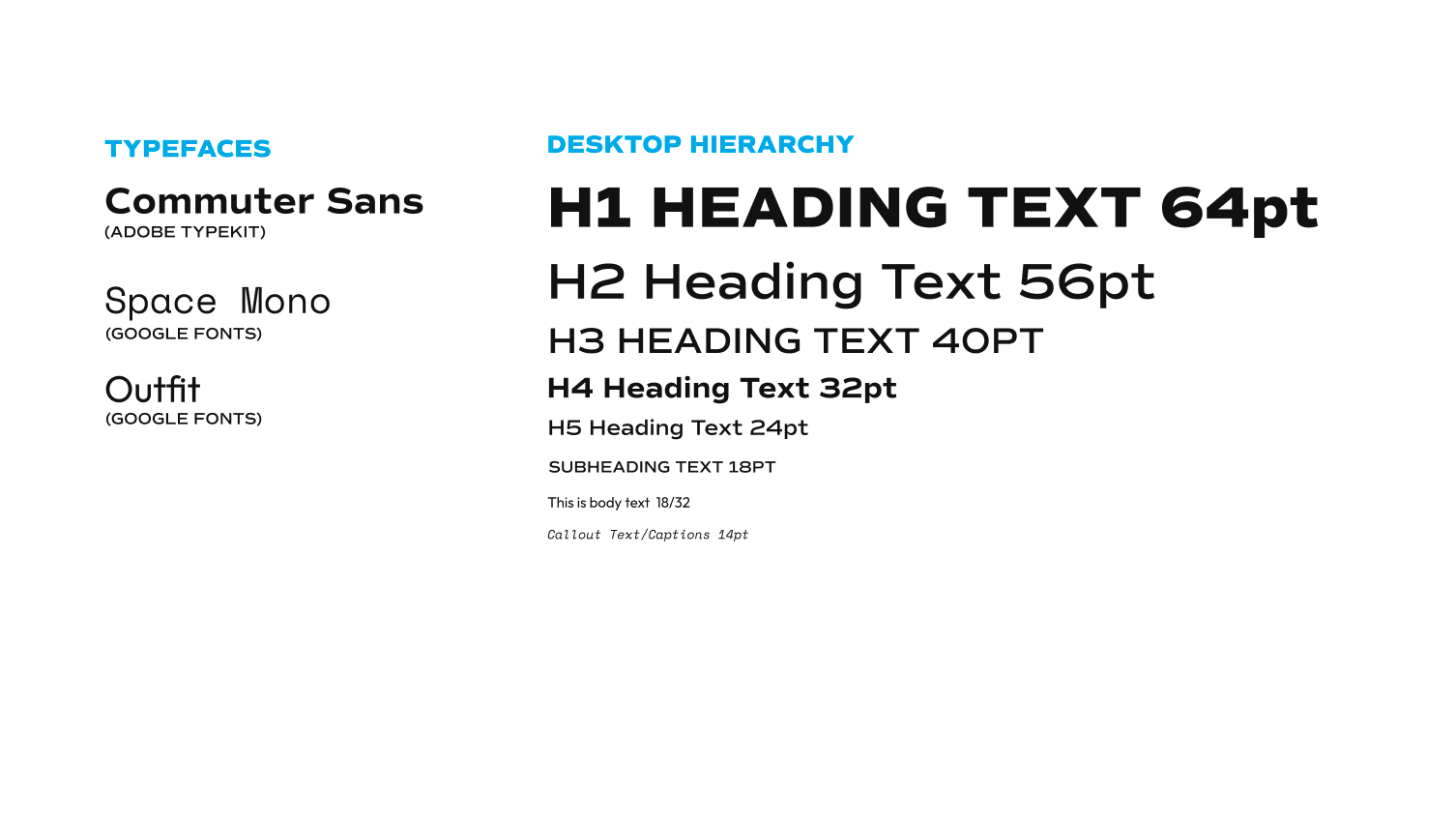


Content Map

Designs and Deliverables
Proposed Lo-Fi Designs
Lo-Fi Designs for the About page (Figma page 1) and Client Apply Page (page 2)
Hi-Fi Designs of Priority Deliverables
Highlighted Features
For the navigation bar, we wanted to utilize a hamburger menu instead of putting links at the top of the page, as we wanted the user to be able to see all of the pages they can navigate to, rather than clutter up the top bar or have to select 2-3 links to showcase. We originally discussed having the opened menu take up the full page, but decided instead to use a side bar so that users would still be able to see the current page they're on as well as have an easy way to exit the menu by simply clicking outside of the sidebar, as opposed to having to click the "X" at the top right-hand corner of a full screen menu. We figured that this would help reduce the users' confusion when navigating and make them more likely to actually refer to the menu.
Going off of this decision, we also decided to clearly lay out links to all of the pages in the footer, as well as having easy access points for users to take action and go to Generate's social media or sign up for the newsletter. At the top of the footer, we also are including a website path so that users can keep track of how they navigated to their current page.
Use the embedded Figma files below to check out the designs!
(Note: These pages are not connected or in order, please use the arrows at the bottom to navigate to each individual page.)
Hi-Fi Designs for the menu bar (page 1), footer (page 2), and Student Apply pages (pages 3-5)
Client Feedback
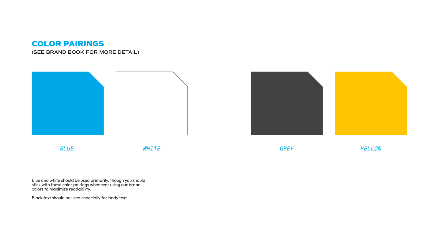
At this point in this process, we arranged a full meeting with our clients (Generate management) to discuss our progress and evaluate our current designs. While client feedback was mostly positive, they expressed interest in moving Generate's brand (and subsequently our designs and website) in a new direction. Management wanted to really make Generate stand out from other product development organizations and clubs, and wanted to make the website more colorful and interactive to capture the attention of potential clients and future members.
Shifting Gears
Updated Style Guide
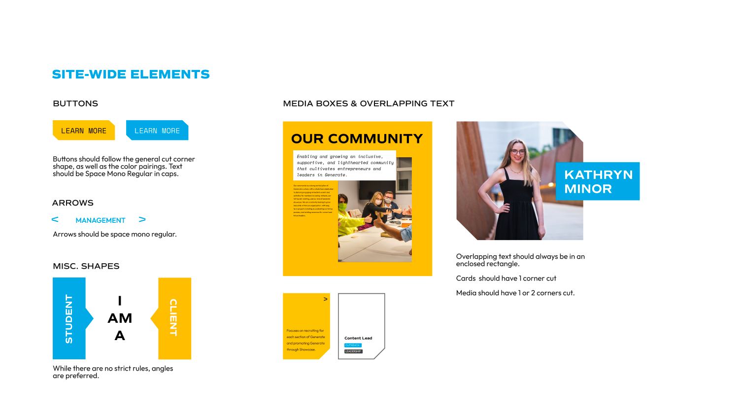
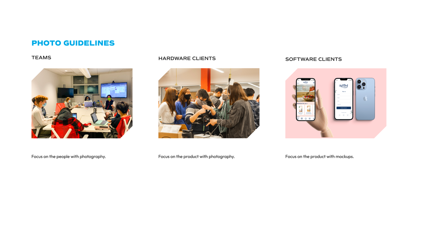
Working with management, the other UI/UX designers and I helped explore updates to the style guide. The central colors of yellow and blue along with the logo were kept, but additional colors were also added to represent the diversity of roles and projects within the organization. The final color palette consisted of six colors, with one color assigned to each team. Color could now be used as a resource to indicate and highlight information about specific teams and their function. Simple decorations and color blocking to balance out the breadth of information were also added to include on the pages.
Page Layout Updates
The major change we decided to make to the website was to implement a horizonal-scrolling layout for most of the main pages. We debated over whether this was a smart idea, but settled on going forward with it after evaluating the goals for this website and the capabilities of our targeted users. We recognized that this was a risk we were willing to take to stand out, and that our user base would likely adjust to the layout change quickly, without there being a steep learning curve.
After deciding on this, we were able to take the content and layout that we had designed for the old version of the pages, and manipulate them a bit to fit the horizontal layout. We also worked towards adding in more color throughout the pages, and developing more interactive elements.
My fellow designers and I started by creating our own individual wireframes for the main pages and interactive elements, and then came together for discussion and critique on how to combine our ideas into one cohesive design. Once we were able to make these decisions, we created and worked on one design together for each page, starting with basic wireframing and eventually building up some of them to high-fi, interactive prototypes.
Check out some of the wireframes and prototypes here:
Next Steps
When we presented the updated website prototypes at our end-of-semester showcase, the overall reaction to the designs was quite positive. Users figured out how to properly scroll fairly quickly and easily, and they liked the interactive elements on the pages.
After making a few more tweaks, the designs were handed off to developers for implementation. And, as of December 2022, the updated Generate website is live!