Product: SHARP Carousel Microwave
Process Documentation
Heuristic Analysis and Recommendations for Redesign
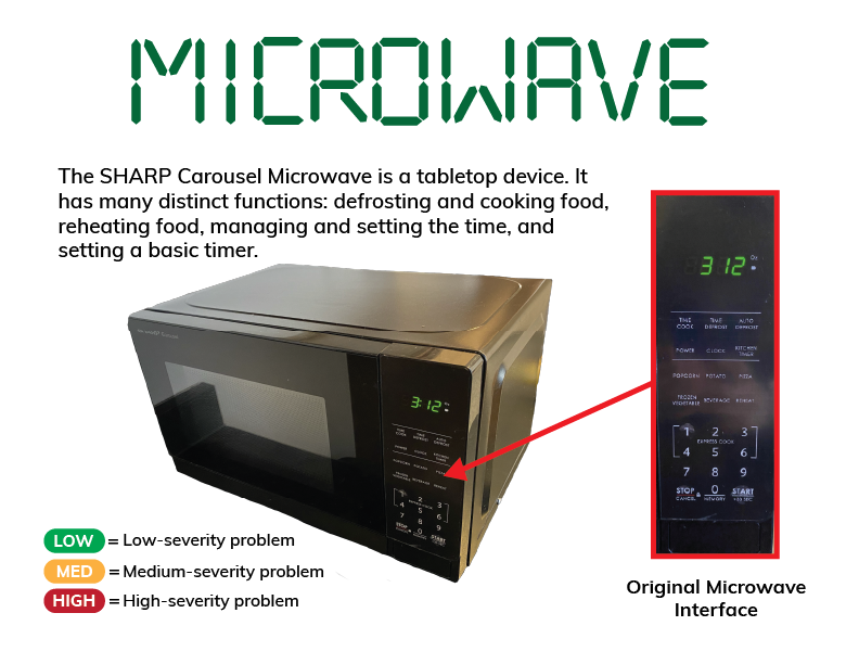
Original Interface
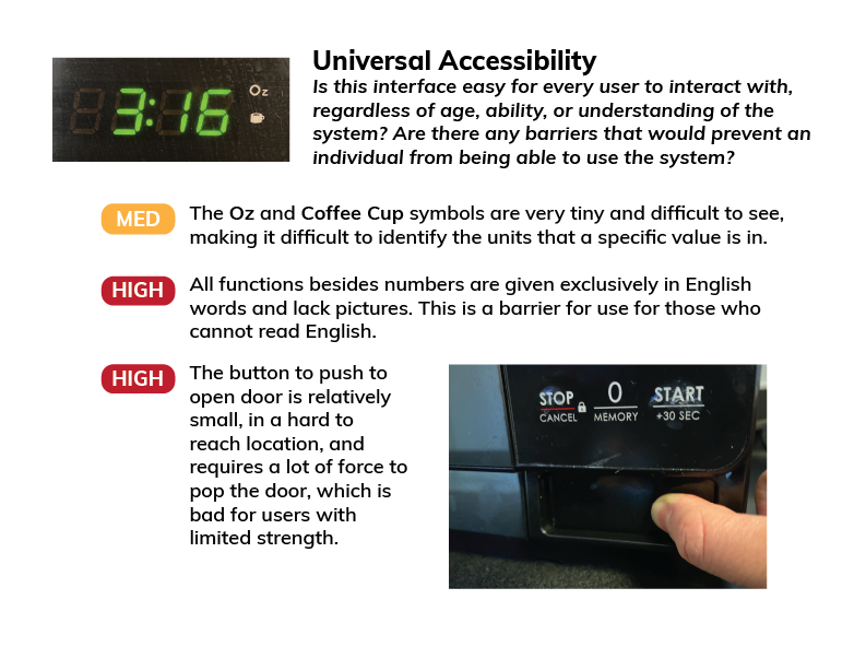
Universal Accessibility Heuristic
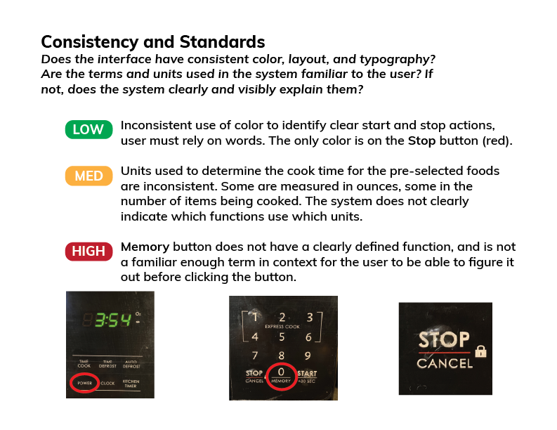
Consistency and Standards Heuristic
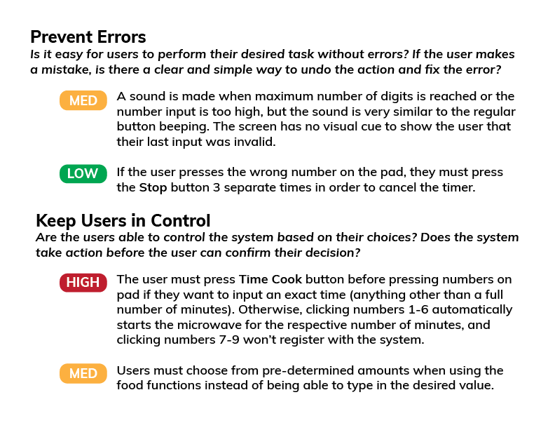
Prevent Errors and User Control Heuristics
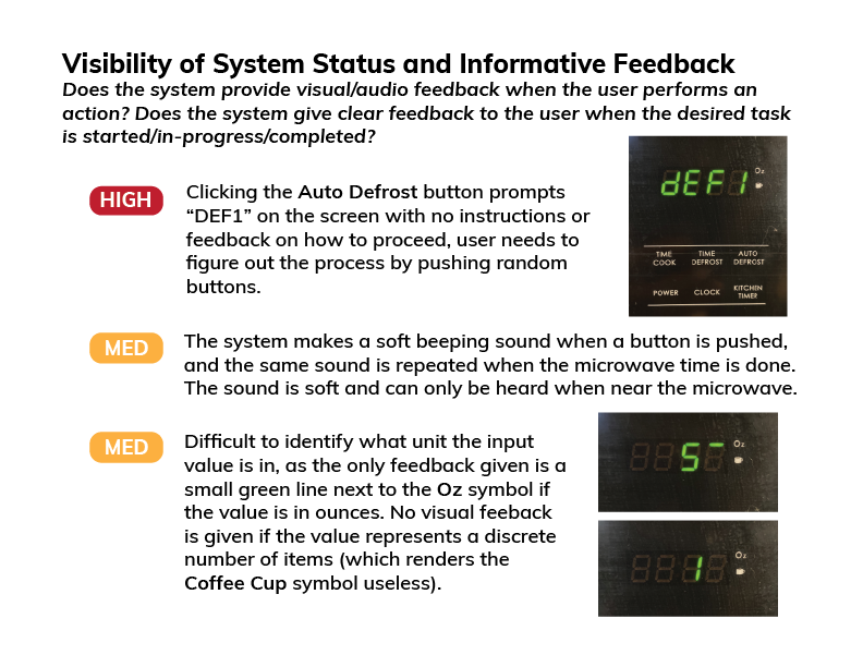
System Status and Feedback Heuristic
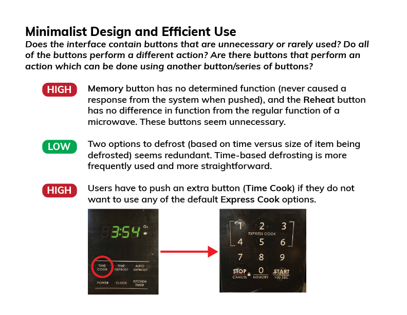
Minimalism and Efficiency Heuristic
Recommendations for Redesign
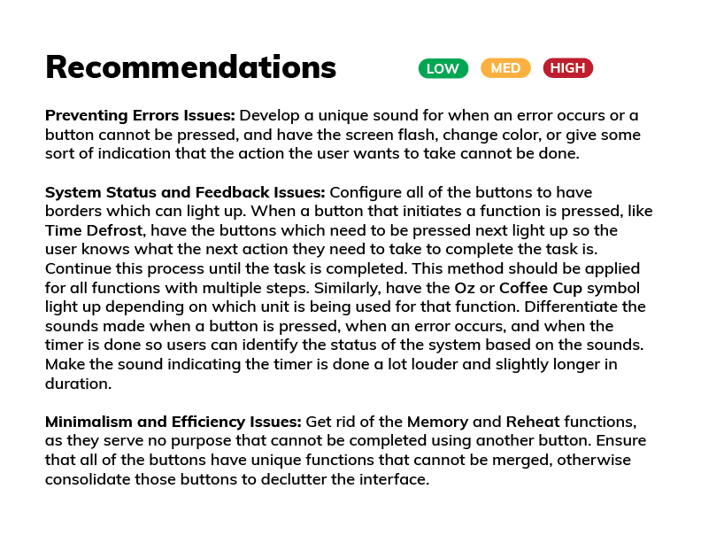
Recommendations for Redesign
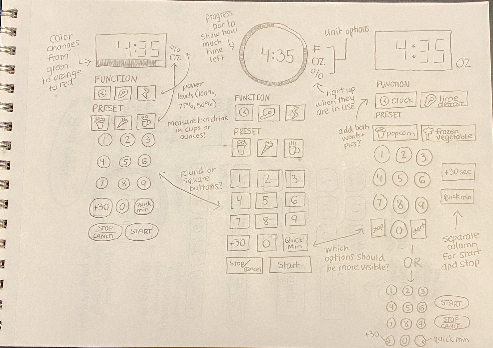
Sketches
Developed Sketch
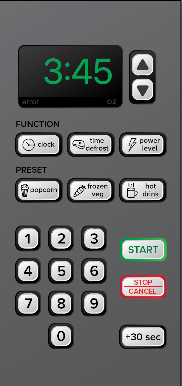
Explanation for Design Choices
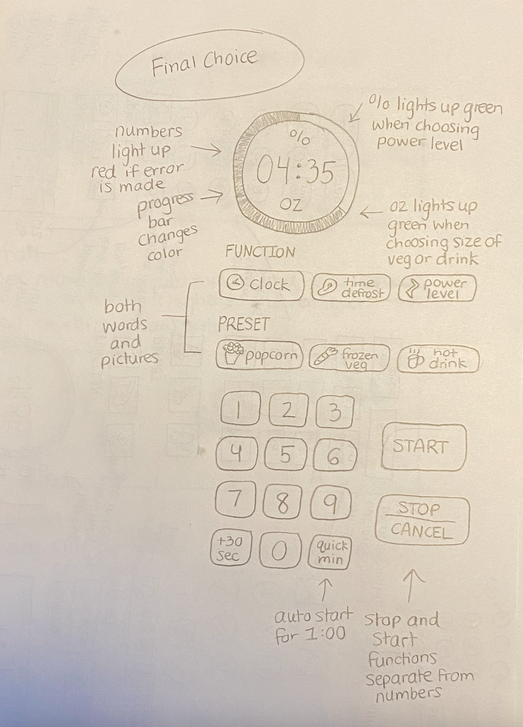
I chose to develop the last sketch that I made for this interface, which is a combination of different features from each of the other three sketches that I wanted to include in my final design. I chose this particular design because I wanted to develop an interface that was simple and clear to use and understand. I focused a lot on the accessibility of the buttons and the visual feedback from the interface. There are only a few preset options, and the ones that I kept are presets that I feel are used pretty often (popcorn) or would be helpful to have because it would make the process of cooking these foods easier. For example, users would know how many ounces of frozen vegetables they are microwaving from the bag, but the exact cook time may vary. Additionally, the hot drink button allows users to choose the volume of the cup they are using and the microwave will determine the proper amount of time to get it to the proper temperature for making tea or coffee. The same goes for the functions, which I kept to a minimum and only chose the most necessary to keep on the interface. A major change I made was getting rid of the Express Cook option, so all timer options will be input manually. I also designed this interface to give a lot of visual feedback, since I found audio feedback to be unclear and confusing. The unit of either % or ounces will appear highlighted in green when a value is being input in that unit, and a progress bar surrounds the time to let the user know how much time until the cooking is done. The bar changes colors from green to orange-yellow to red based on how much time is left, so the user doesn’t need to read the exact value on the timer to estimate how much longer they have to wait. Once a function or preset is pressed, a light surrounds the button to show that it has been pressed, and highlights the next step the user has to take. Finally, if the user tries to type in a value for a function which cannot be completed, the numbers on the timer will light up red until the user types in an appropriate value. In terms of universal accessibility, I chose to put both pictures and words for each of the functions so literacy and language barriers would not prevent someone from interacting with the interface.
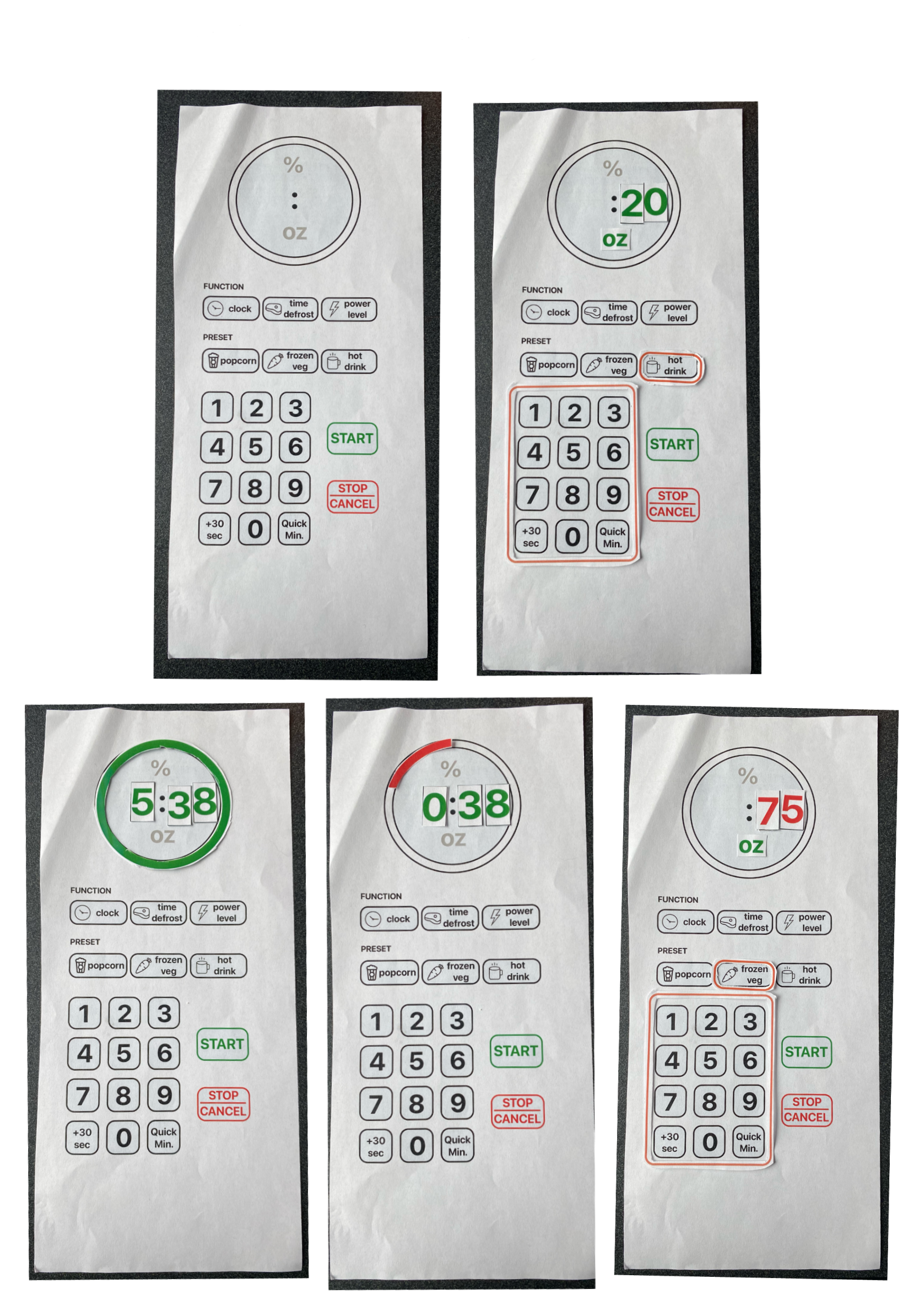
Lo-Fidelity Prototype
User Testing for Lo-Fidelity Prototype
Evaluation Tasks
1. Set the microwave to defrost for 4 minutes and 56 seconds.
2. Change the power level to 75%.
3. Heat up a 92 ounce hot drink.
4. Heat up 10 ounces of frozen vegetables.
5. Start the microwave timer for 6 minutes and 38 seconds.
6. Start the microwave timer for 1 minute, pause it when the 1 minute timer is close to being done, then add 30 seconds.
Note-Taking Questions
1. Did the user complete the task? YES or NO
2. What pathway did the user take to complete the task? OPEN ENDED
3. Did the user run into any problems or issues when attempting the task? YES or NO
4. Additional comments, notes, and observations.
Results of User Testing
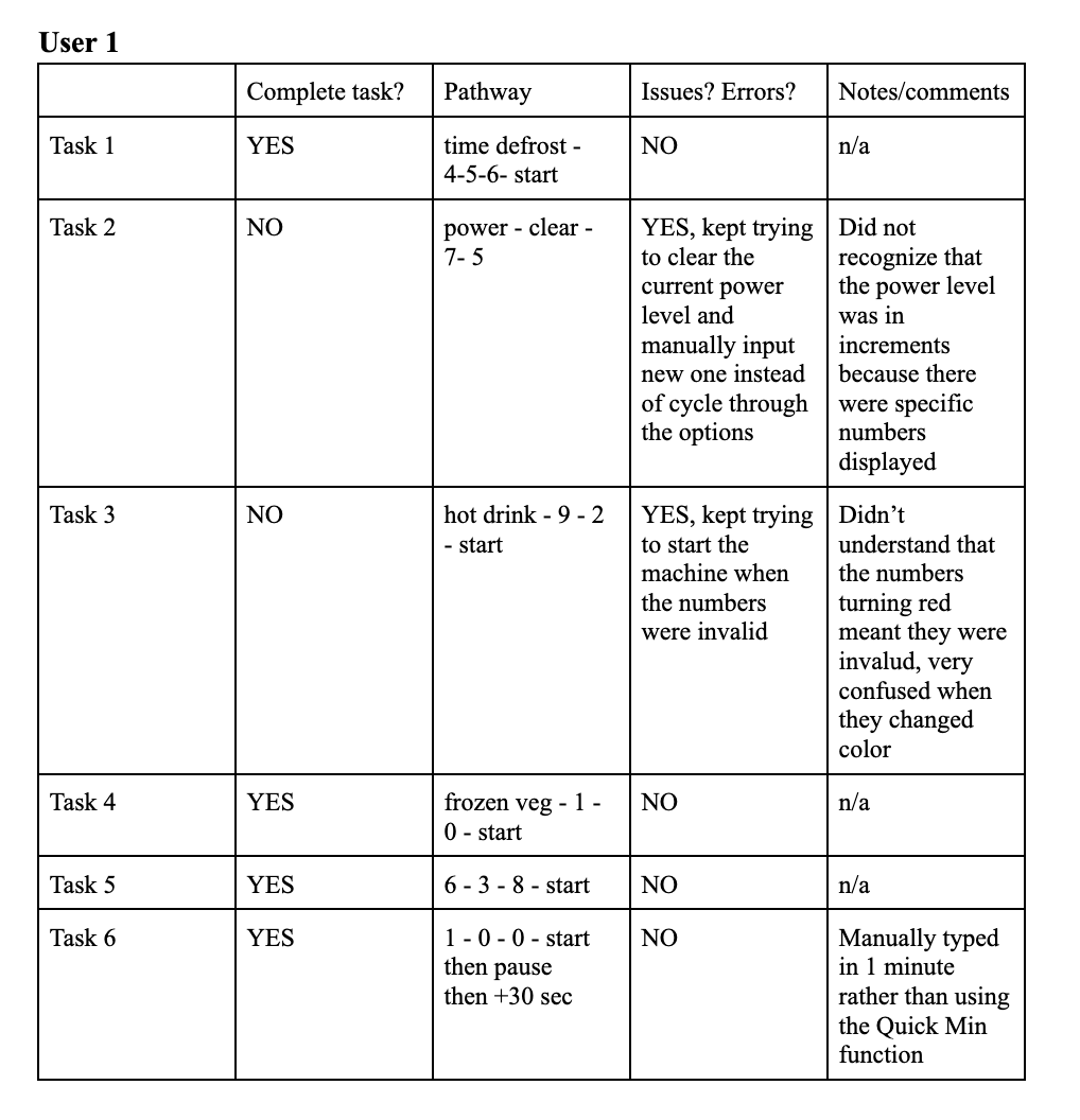
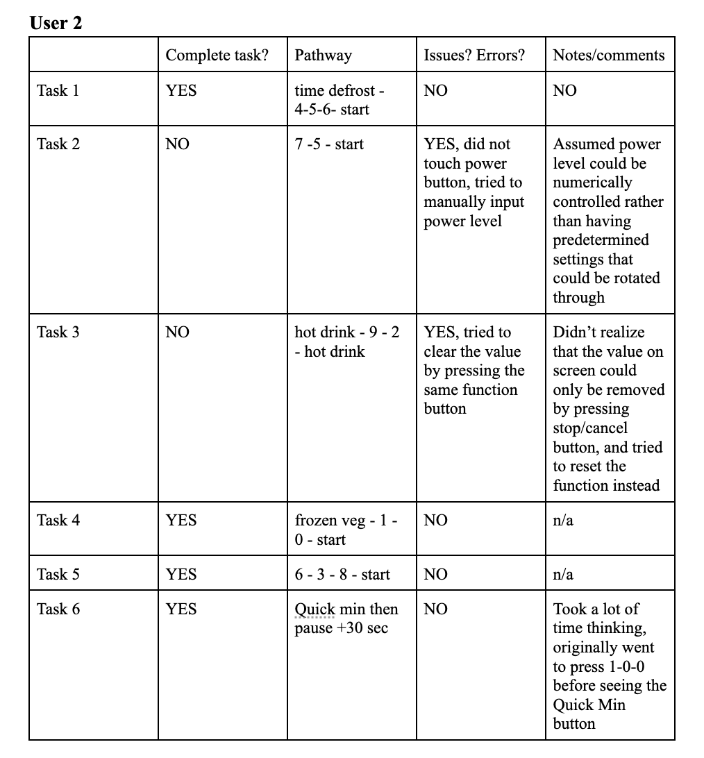
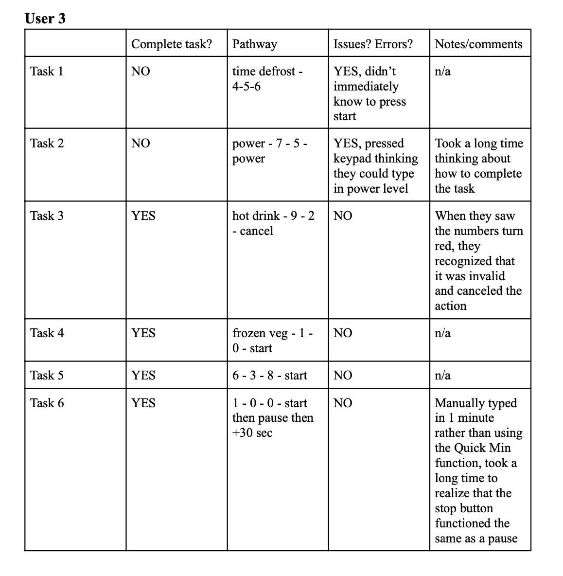
Summary of Key Findings
• Users occasionally struggled with knowing what sequence the buttons needed to be pressed in
• This could be due more so to the presentation of the prototype than its actual functioning, as it took me some time to display the system response after the user pressed a button, and sometimes the user pressed a whole sequence of buttons before I could display any of the system responses
• The method of displaying an error was unclear, as a simple color change was not enough information to get the users to cancel their action
• Users did not understand how to use the power function, and all thought that power levels could be changed by manually inputting a value, and didn’t think to press the button again to cycle through predetermined options
• Users opted to manually input 1-0-0 to set the timer for 1 minute rather than use the Quick Min function
Changes to Make in Final Redesign
• Make the visual cues more obvious (ex: displaying the word “error”, or “cancel action”
• Include two arrow buttons on the interface and let them light up after power button is pressed to make the next action more obvious, and potentially change levels from numerical values to LOW, MED, HIGH
• Eliminate the Quick Min button since it seems unnecessary and not frequently used
Annotated Interface Redesign
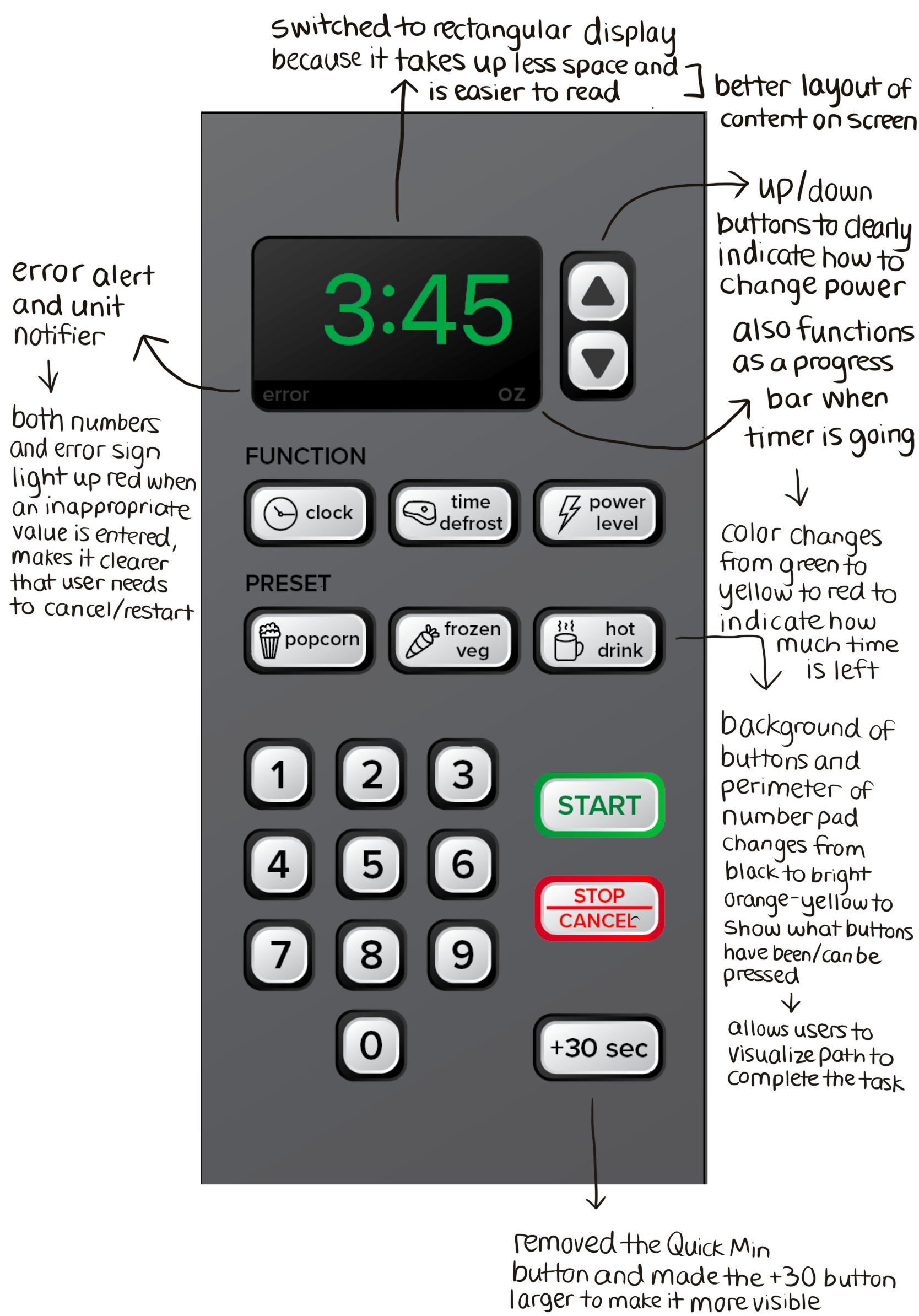
Final Redesign and Mockup
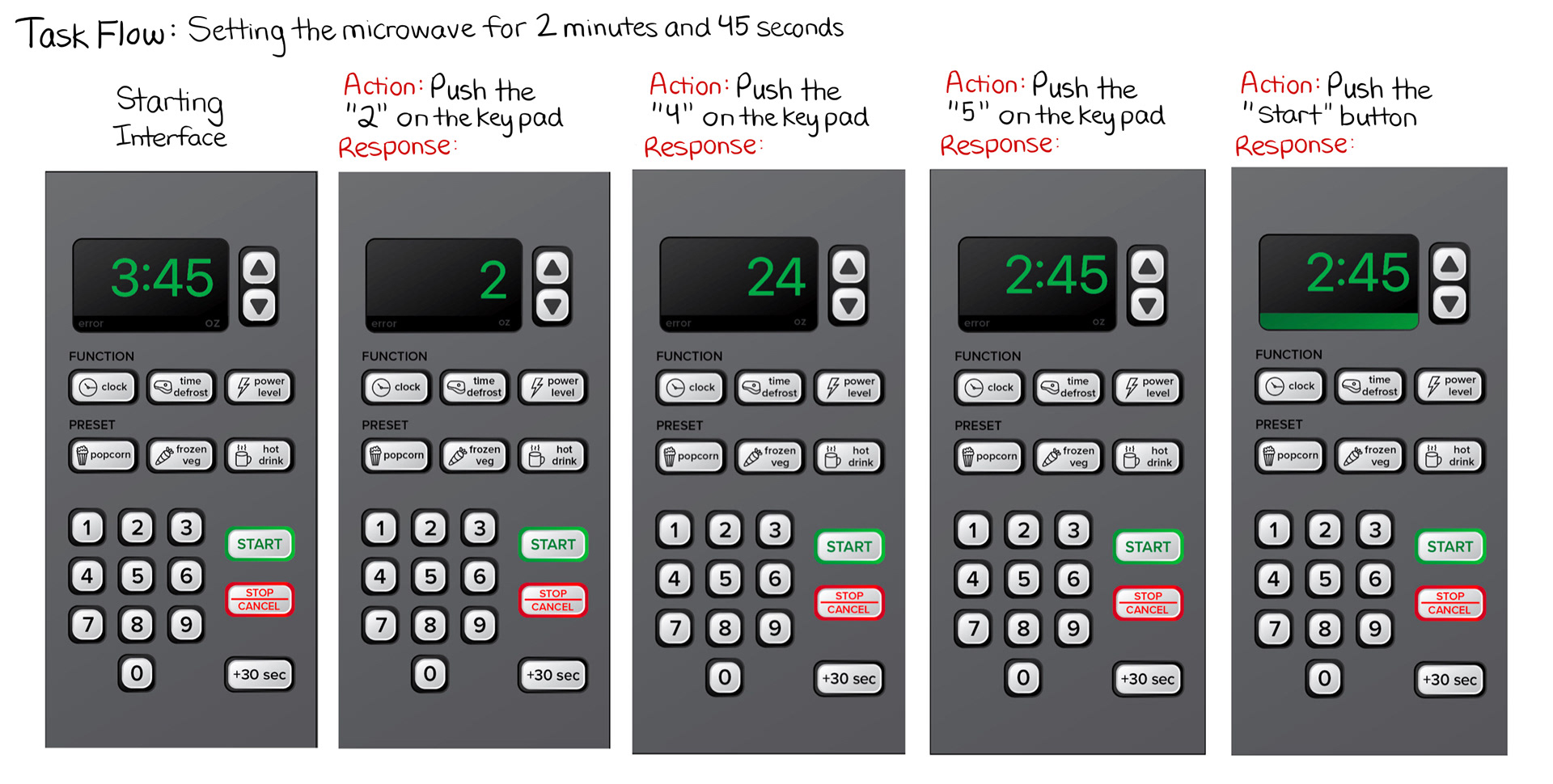
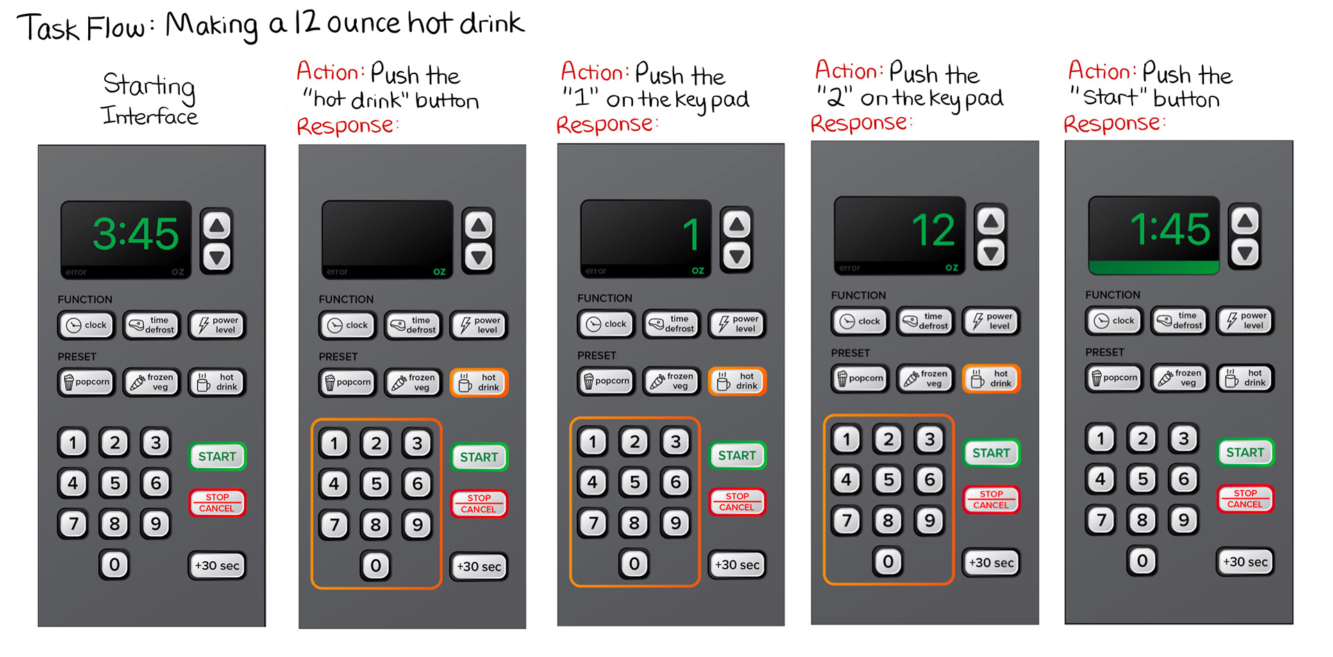
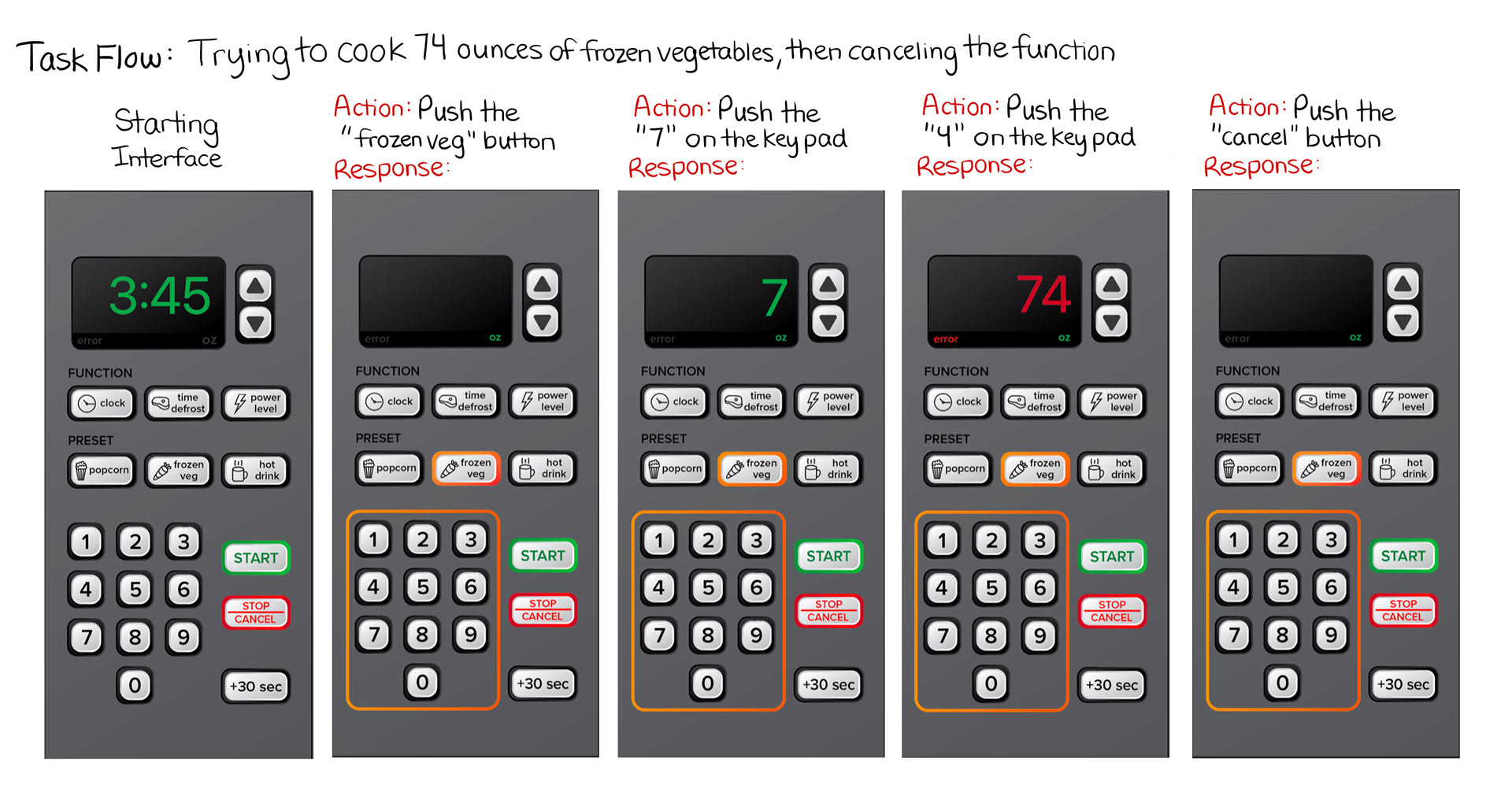
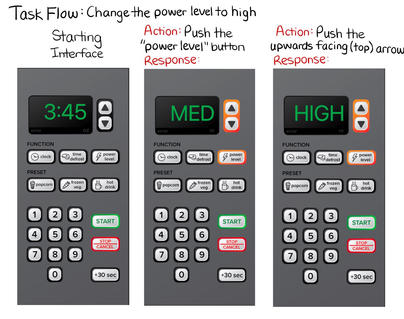
Task Flows